Santander Bank
Redesigning for a modern banking web experience, making it easier for people to find the right accounts and services to suit their needs.
Challenge
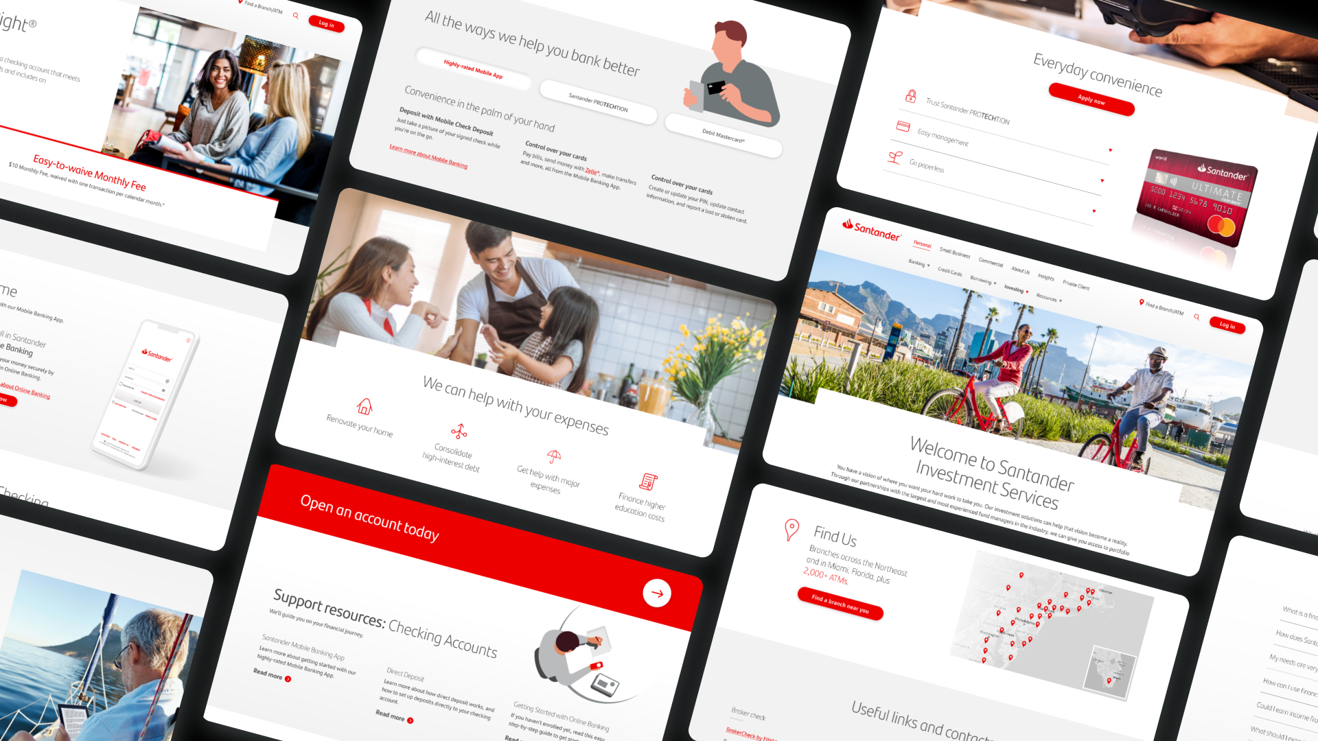
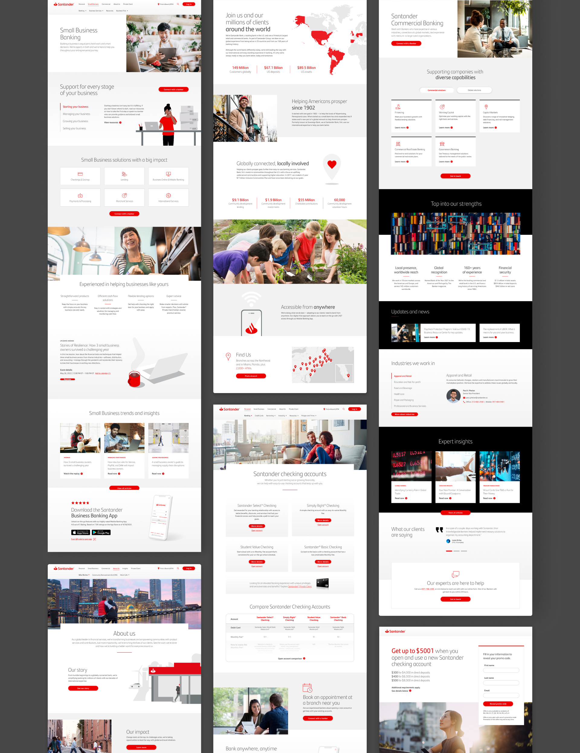
Despite having more than 575 branches spread over nine states, Santander has limited name recognition in the US and was significantly behind the competition. They needed to reintroduce themselves as a forward-thinking, digitally enabled financial partner. Their current site was also inefficient at converting potential customers in major products, such as checking and savings, in addition to other personal, business, and commercial banking solutions.
Solution
We did a heuristic and competitive analysis to discover key user frictions, and partnered with each line of business to completely restructure and redesign the retail, small business, and commercial sections of the Santander site. We built a comprehensive design system to power an open, modern experience that gave people clear, simple pathways to finding information and taking action.
PROJECT
Website design, design system, video production
ROLE
Design Lead & Art Direction
COLLABORATION
Part of the Santander team at GALE Partners
KEY DISCOVERY ACTIVITIES
Stakeholder Interviews
Our stakeholder interviews allowed new and legacy leadership to come together and align on the new website vision – nimble and flexible, easy to use, and putting the customer first.
Site & Content Audit
Our audit revealed complex navigation and wayfinding throughout, numerous interface inconsistencies, and friction-filled paths to acquisition.
Look & Feel
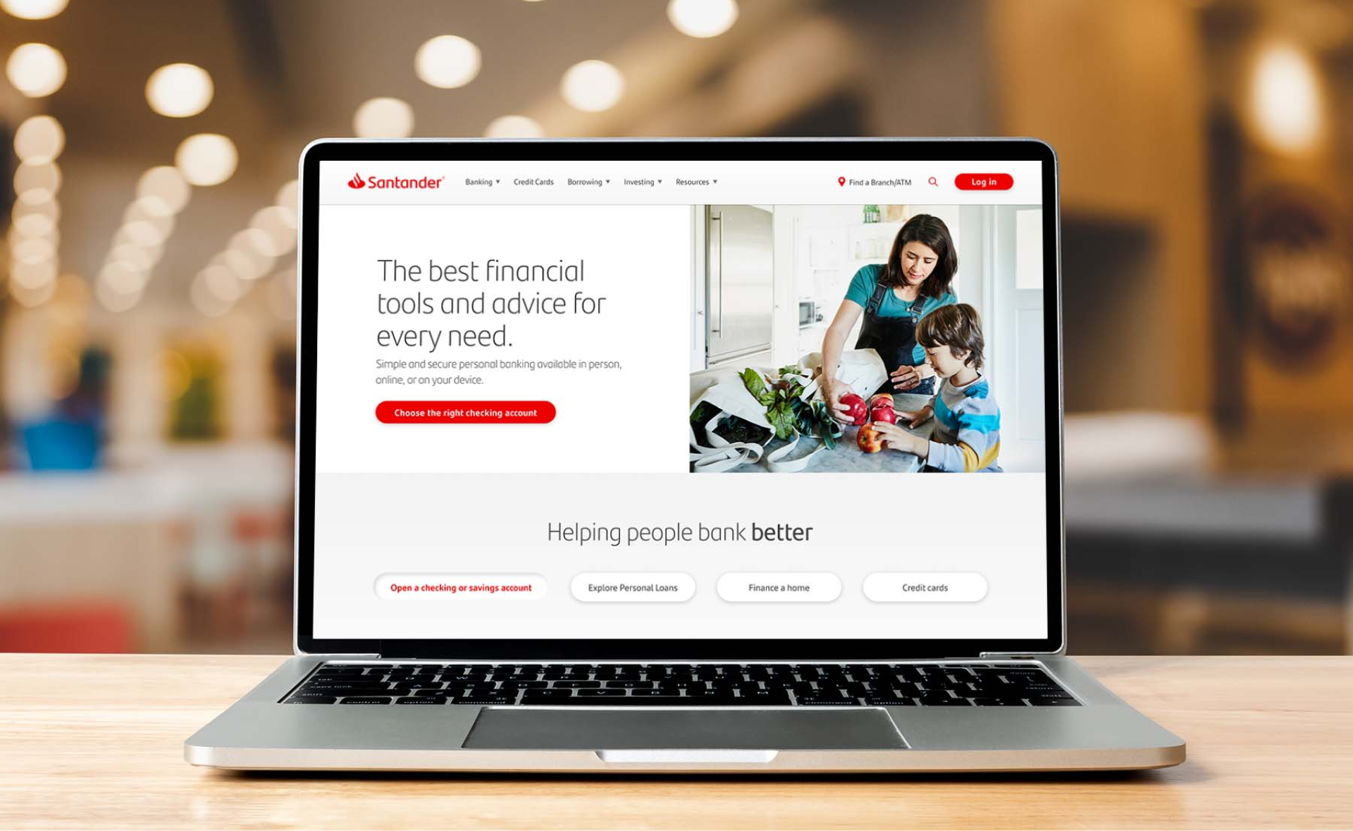
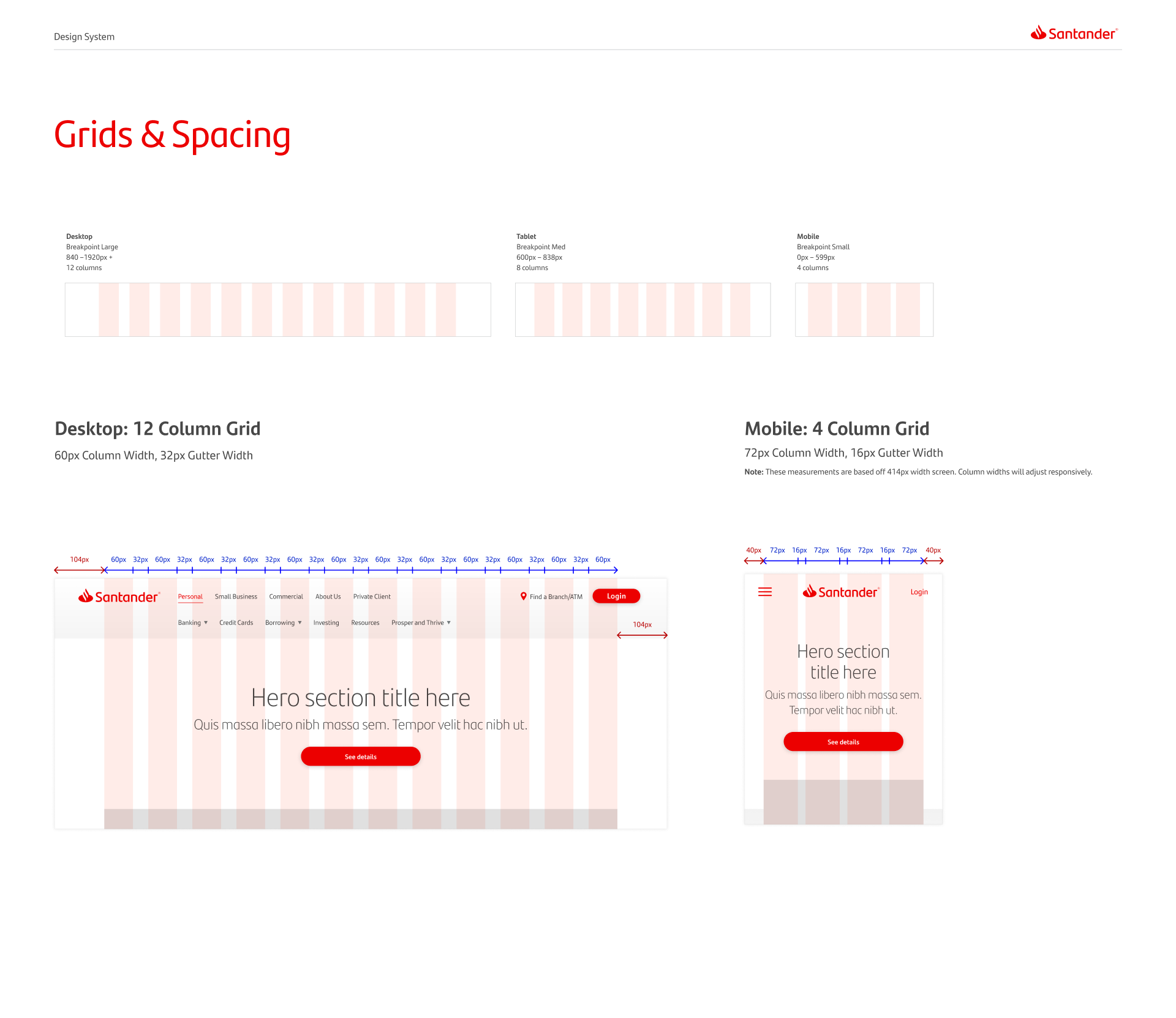
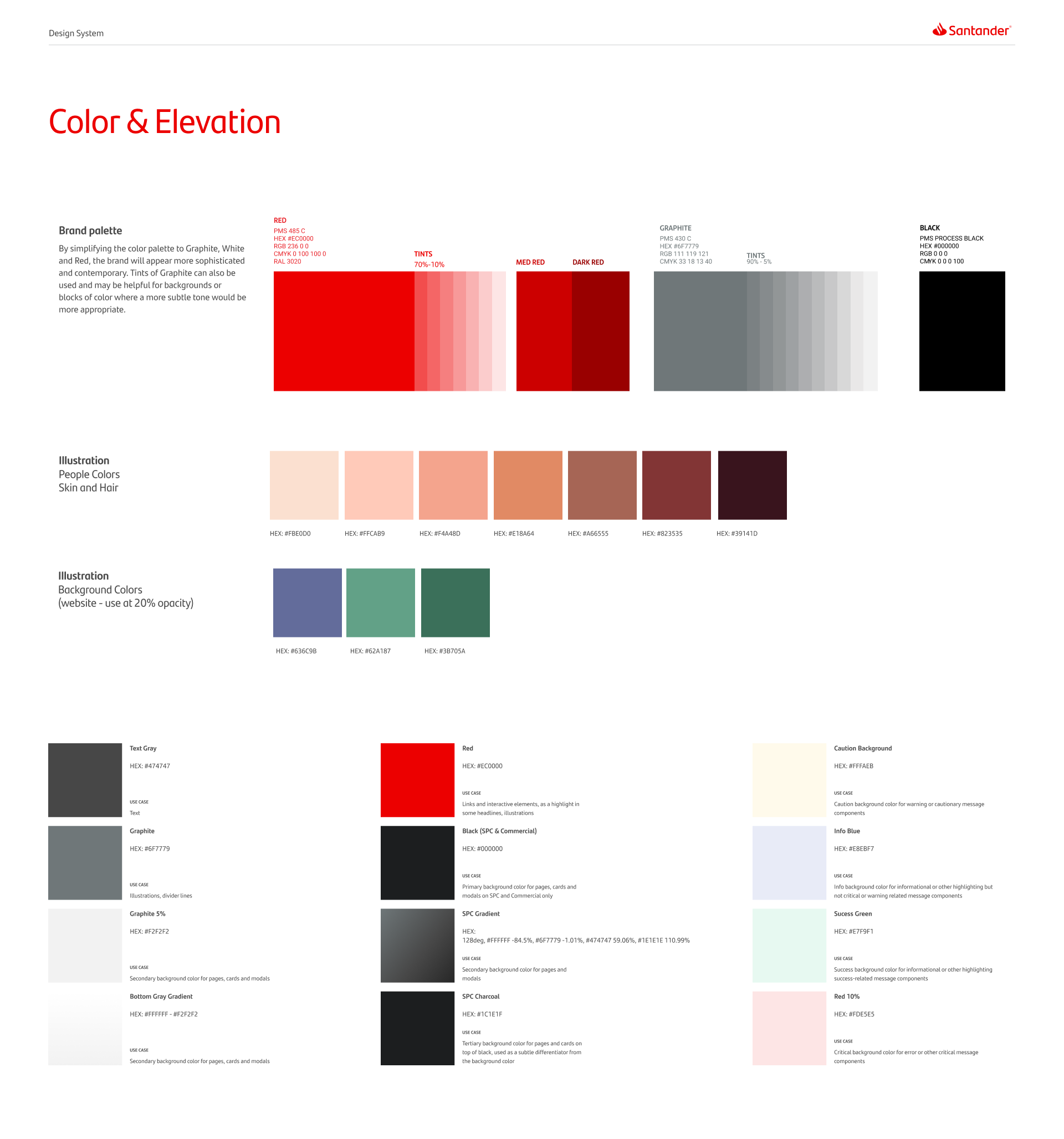
We concepted a new, refined visual design that was open, modern, and sophisticated, as well as mobile-first, accessible, and which uses reusable components for efficiency.
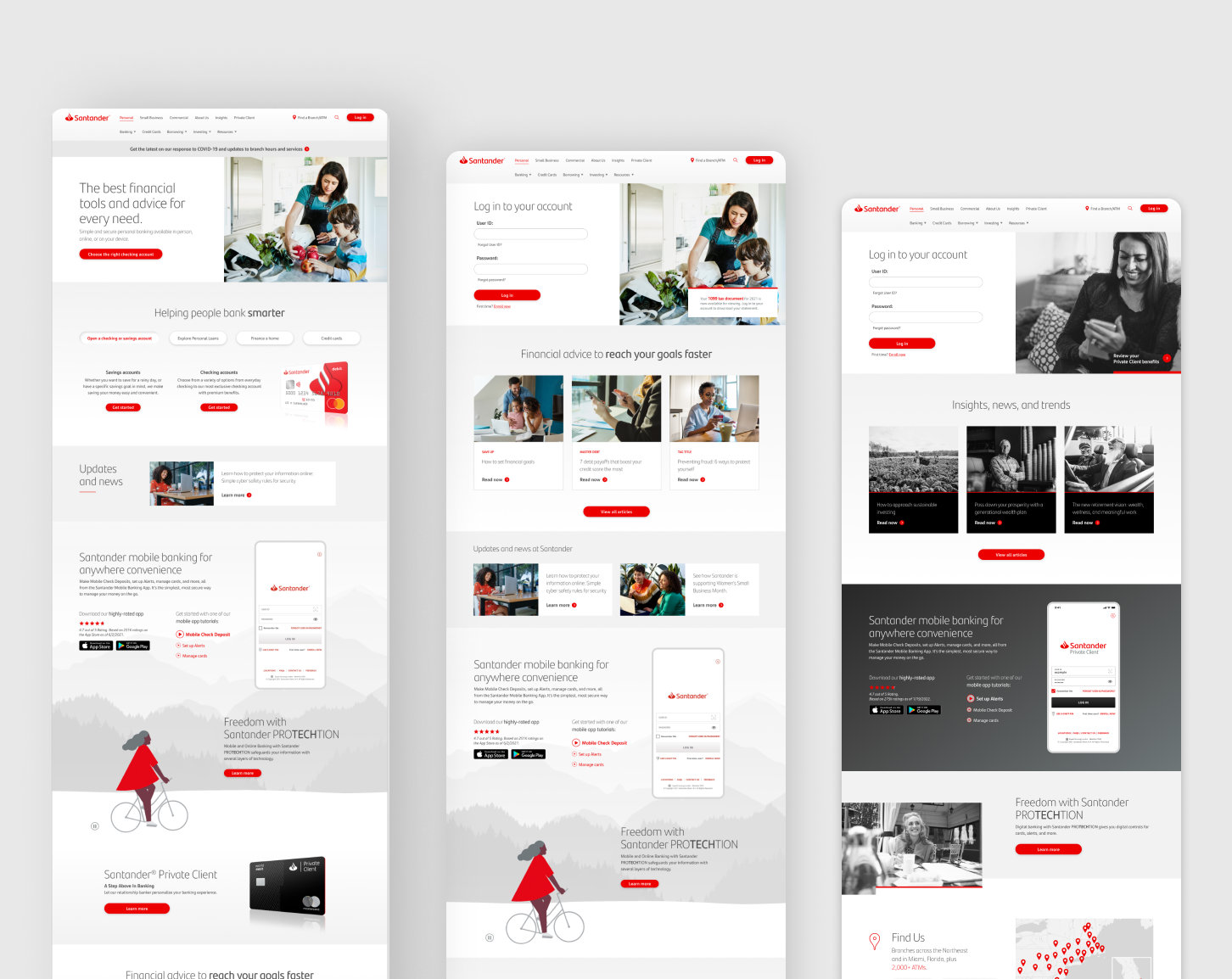
Smart & Personalized
The website learns after each visit and curates a personalized home page for returning users.
It can offer easy access to log in or relevant products and services.
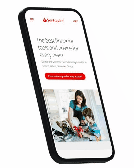
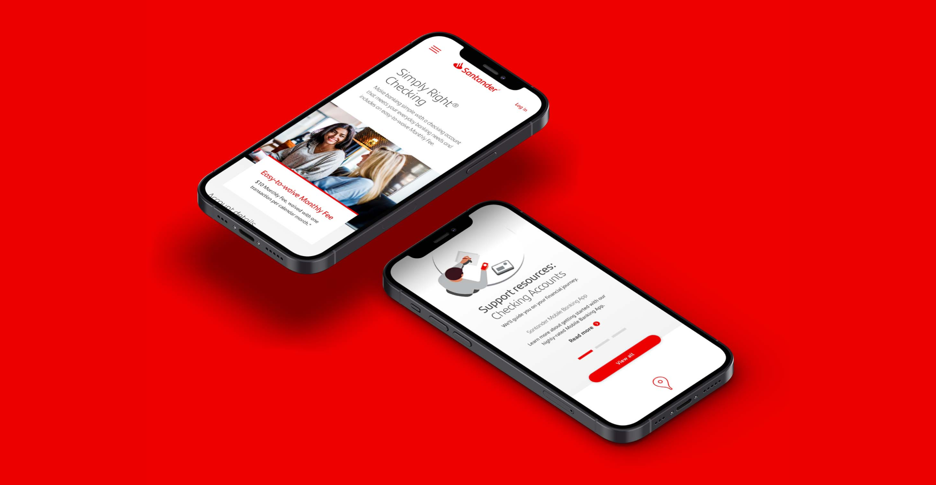
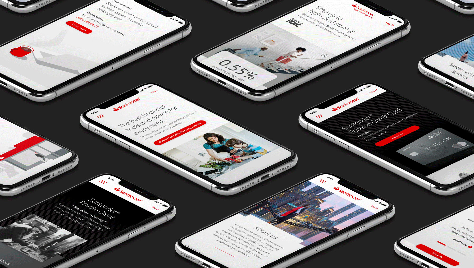
Mobile First
Designed from the ground up for taps rather than clicks. Each graphic, tool and interaction optimized for viewing on mobile devices.
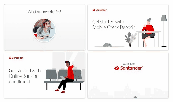
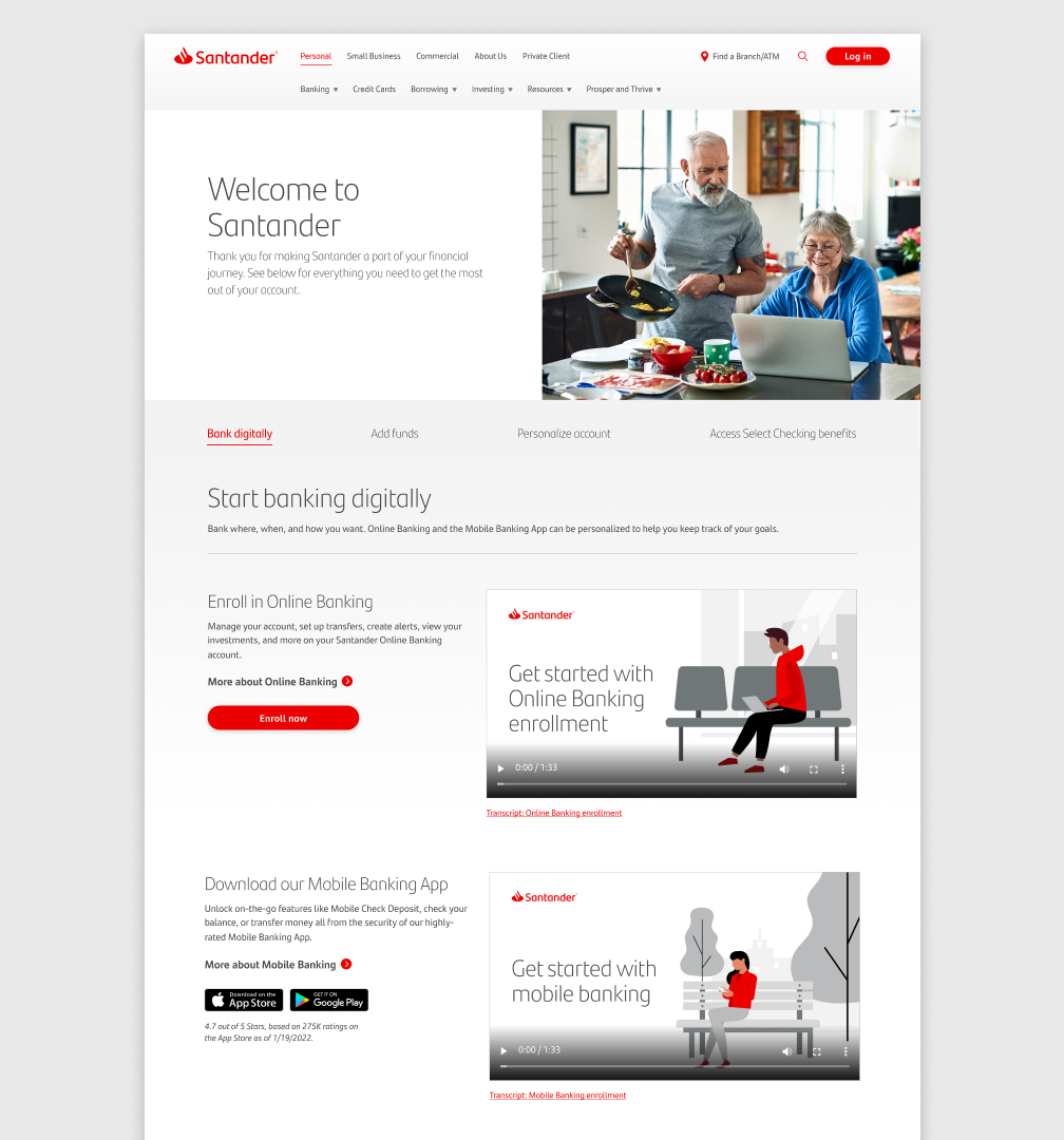
Immersive Storytelling
As part of the site’s content, we developed a series of “Explainer Videos” for new customers to help get them started with everything from savings goals to mobile banking.
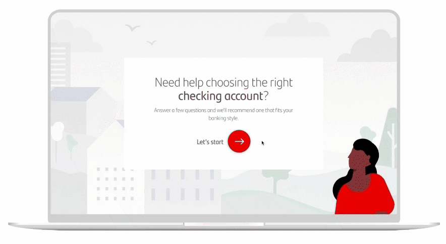
The Advice Assistant
The “Advice Assistant” is an interactive tool to help people compare and choose the right banking products.
After answering a few simple questions, customers are presented with the right checking account or credit cards to meet their needs.
See the prototype here.
DESIGN PRINCIPLES
People First
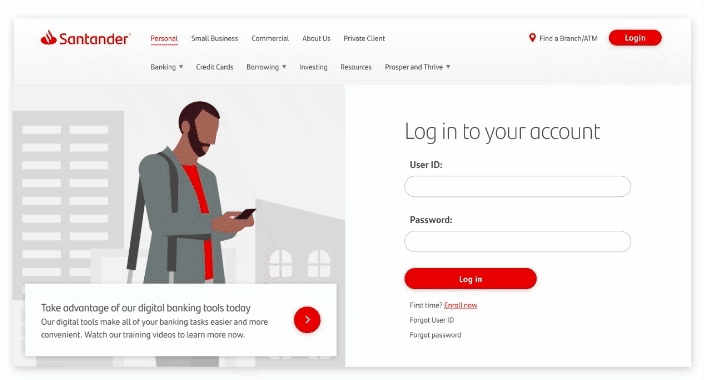
The Santander website provides information that is essential, and allows users to easily take action without unnecessary distractions.
Provide Focus
Whenever users go to the Santander website, they see updated relevant content. The look and feel is consistent but personalized to their experience.
Purpose, Not Pages
The Santander website provides information that is essential, and allows users to easily take action without unnecessary distractions.
Audience Targeted Experiences
Segment-based variation on the personal banking homepage:
- Homepage for Prospects
- Homepage for Clients
- Homepage for Santander Private Client
- Homepage for Select Relationship Clients
Tailored content based on recent behaviors:
- How to Fund for unfunded accounts
- Go Paperless for non-paperless accounts
- Complete your application for abandoners
- Welcome for new clients
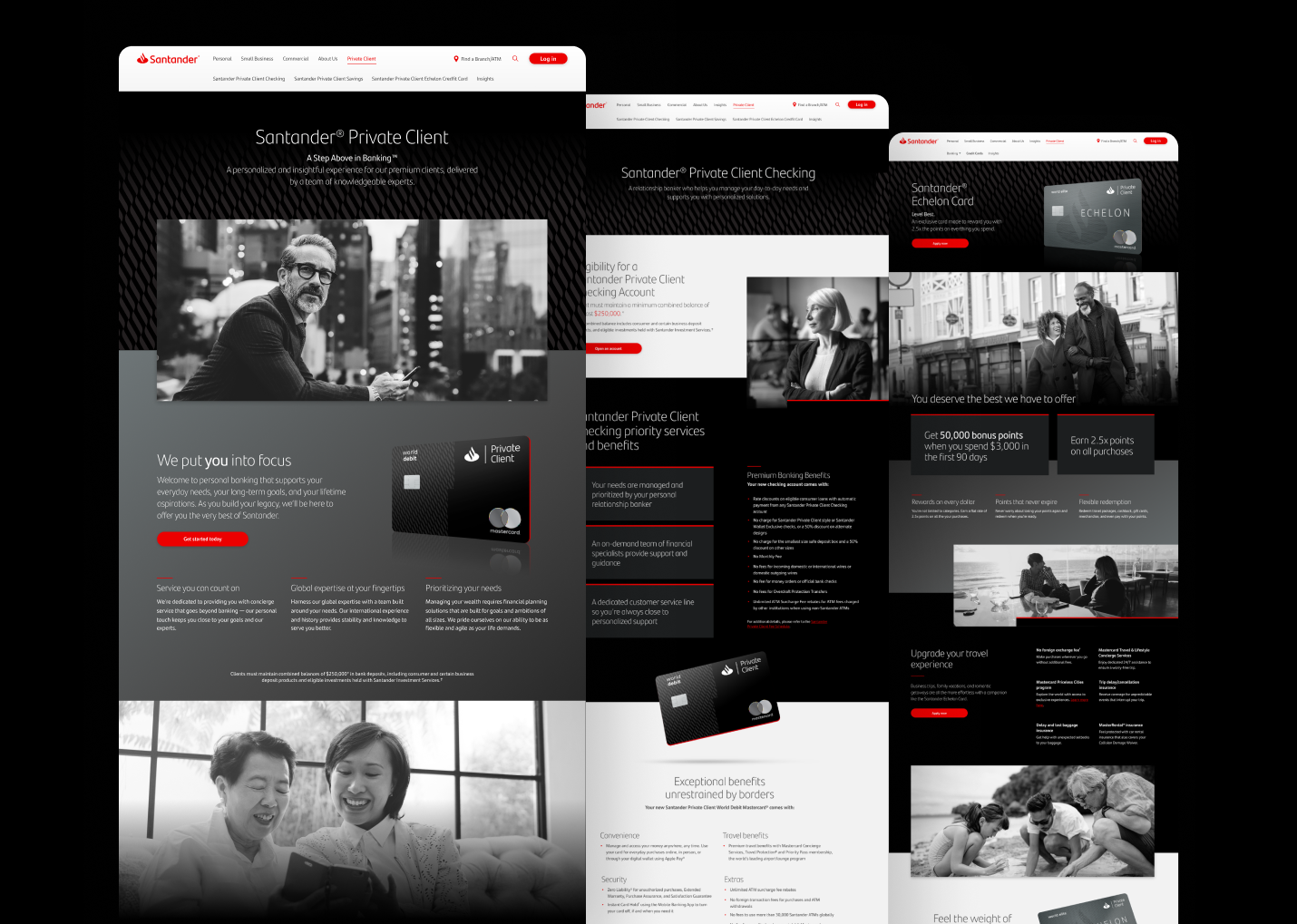
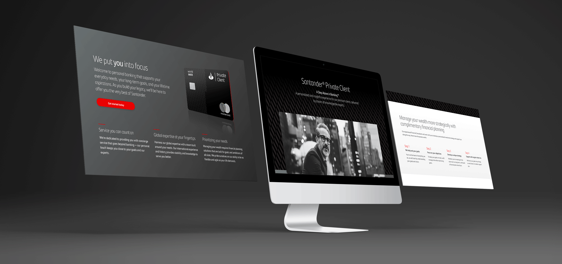
Santander Private Client
For Santander Private Client, a differentiated art direction was established to elevate the line of business and distinguish it from the regular personal banking services and offerings.
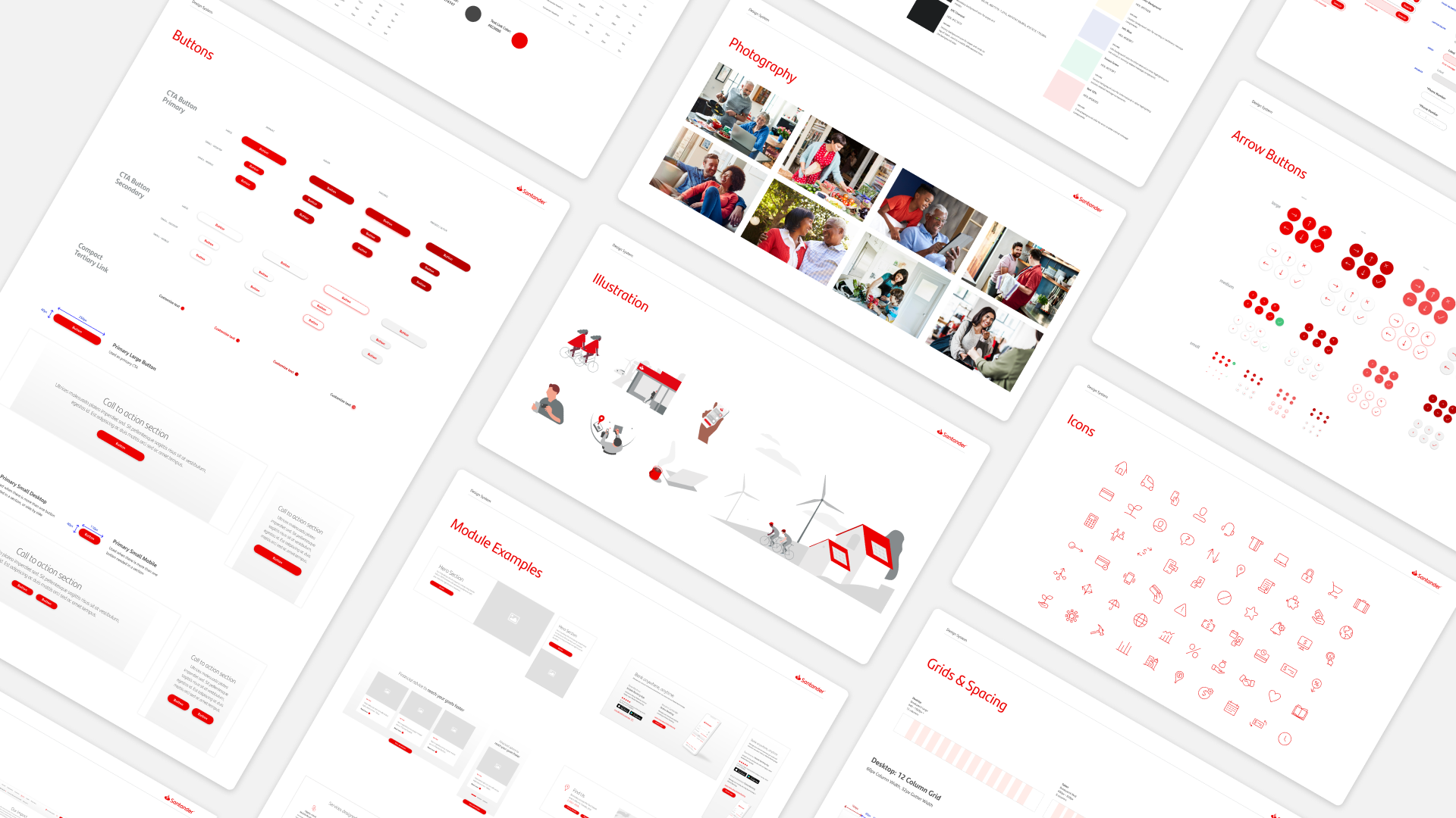
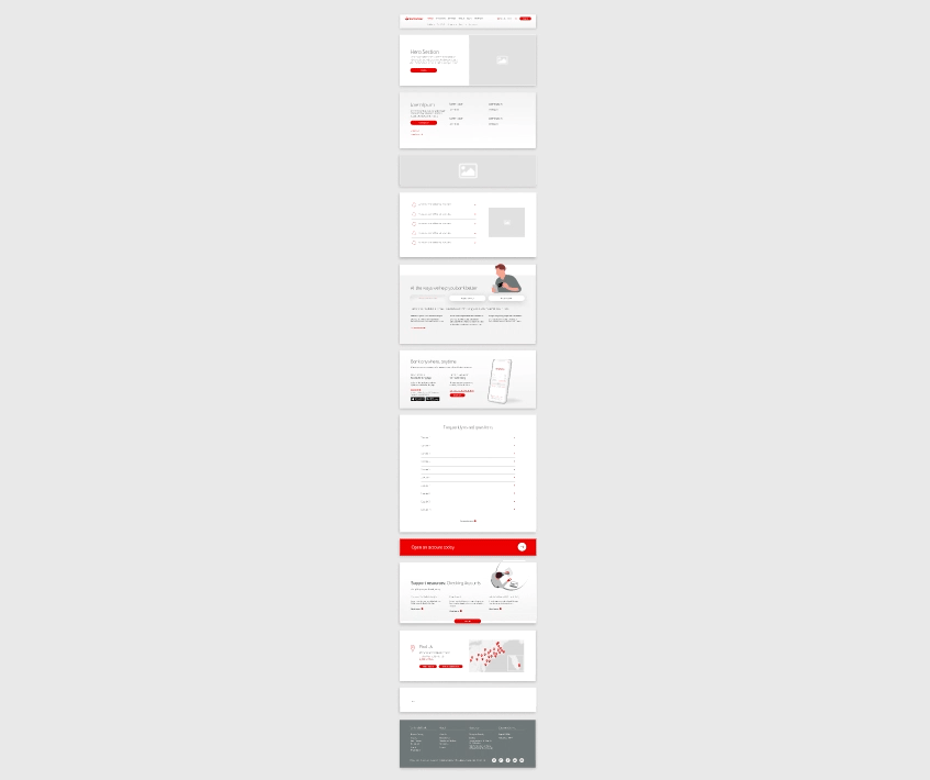
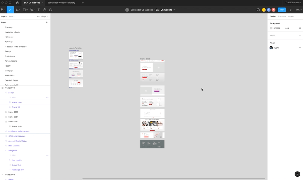
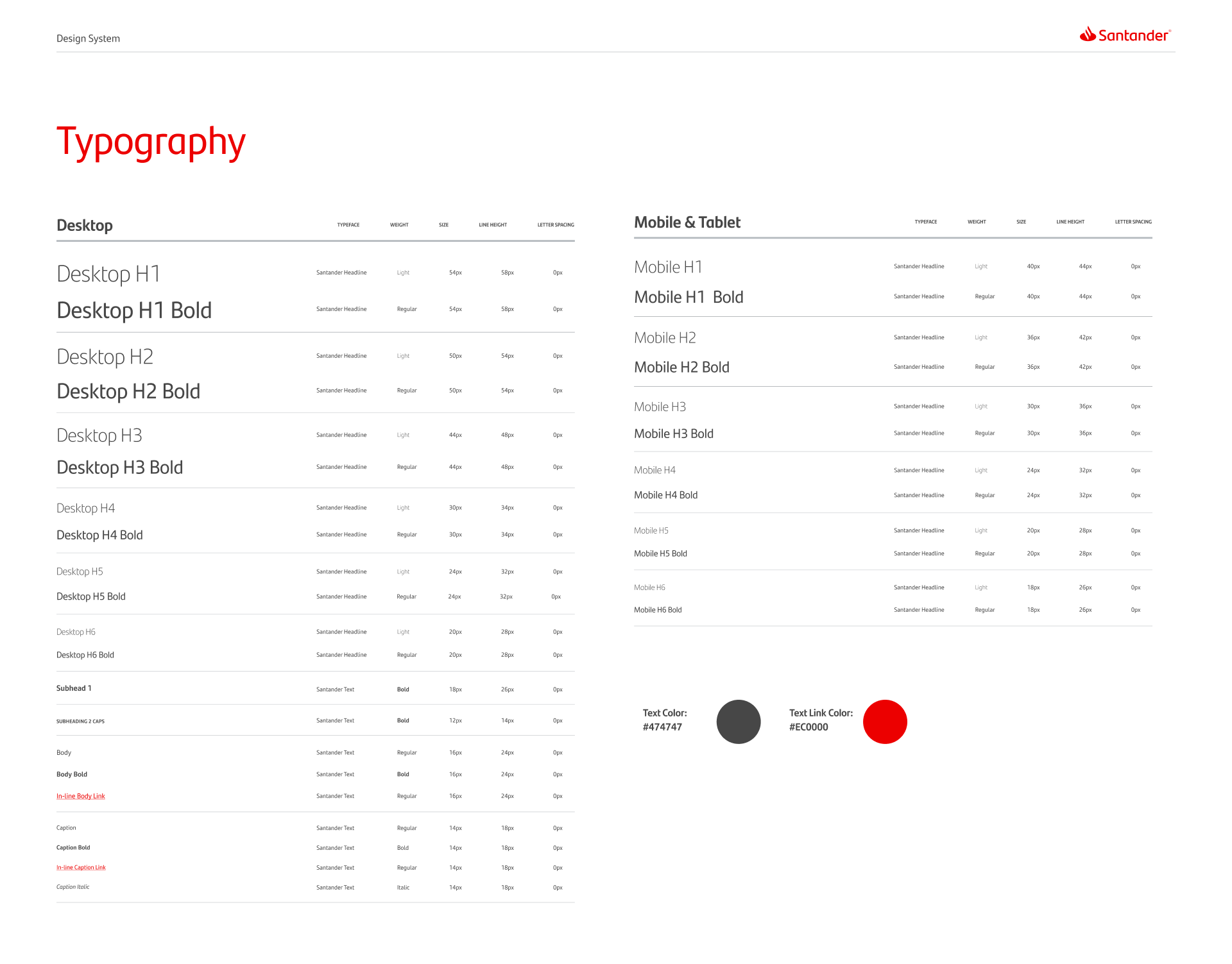
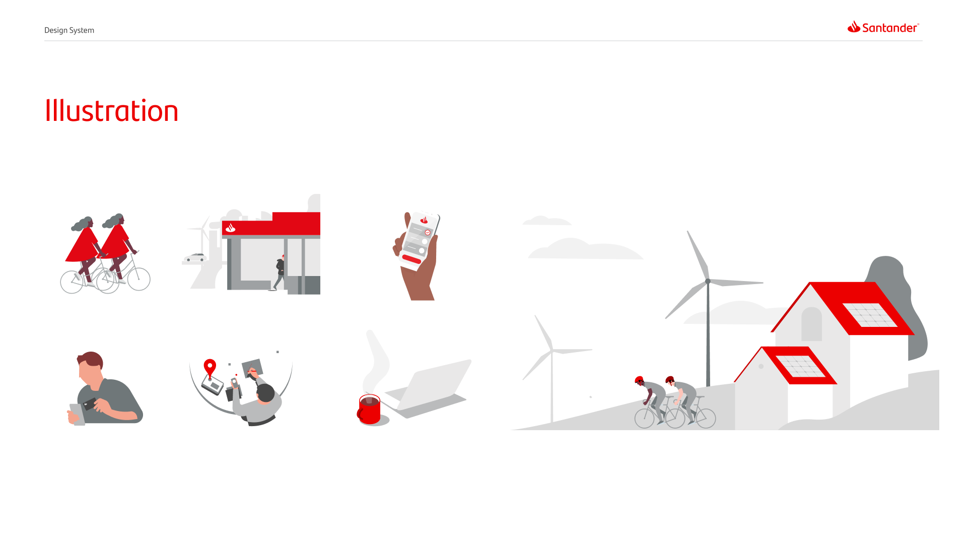
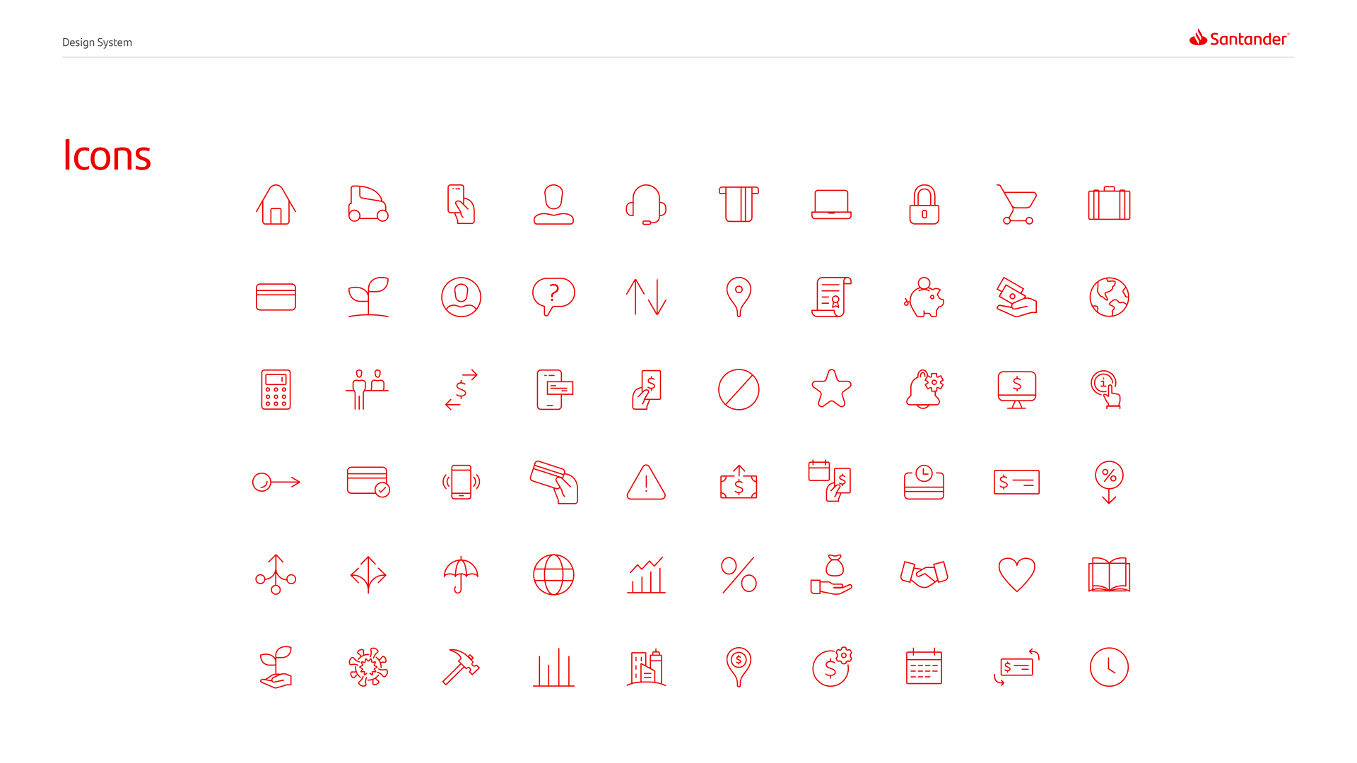
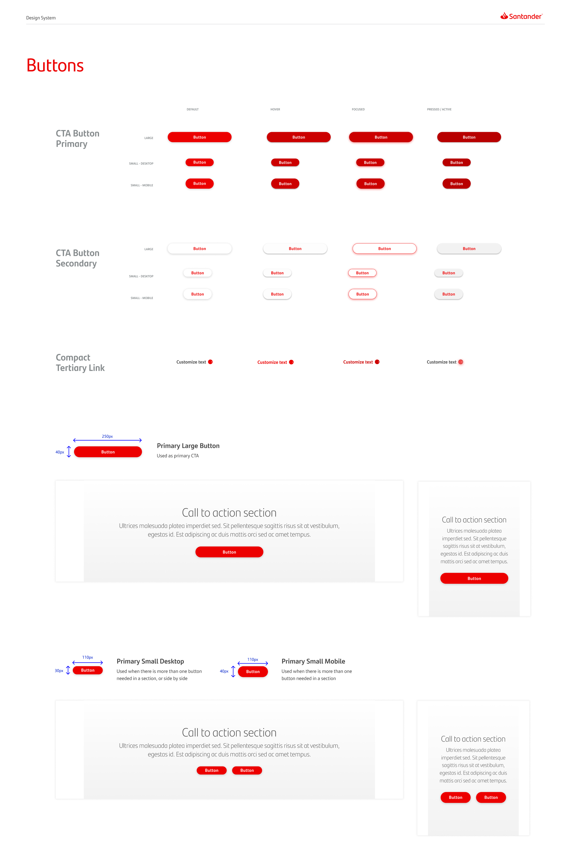
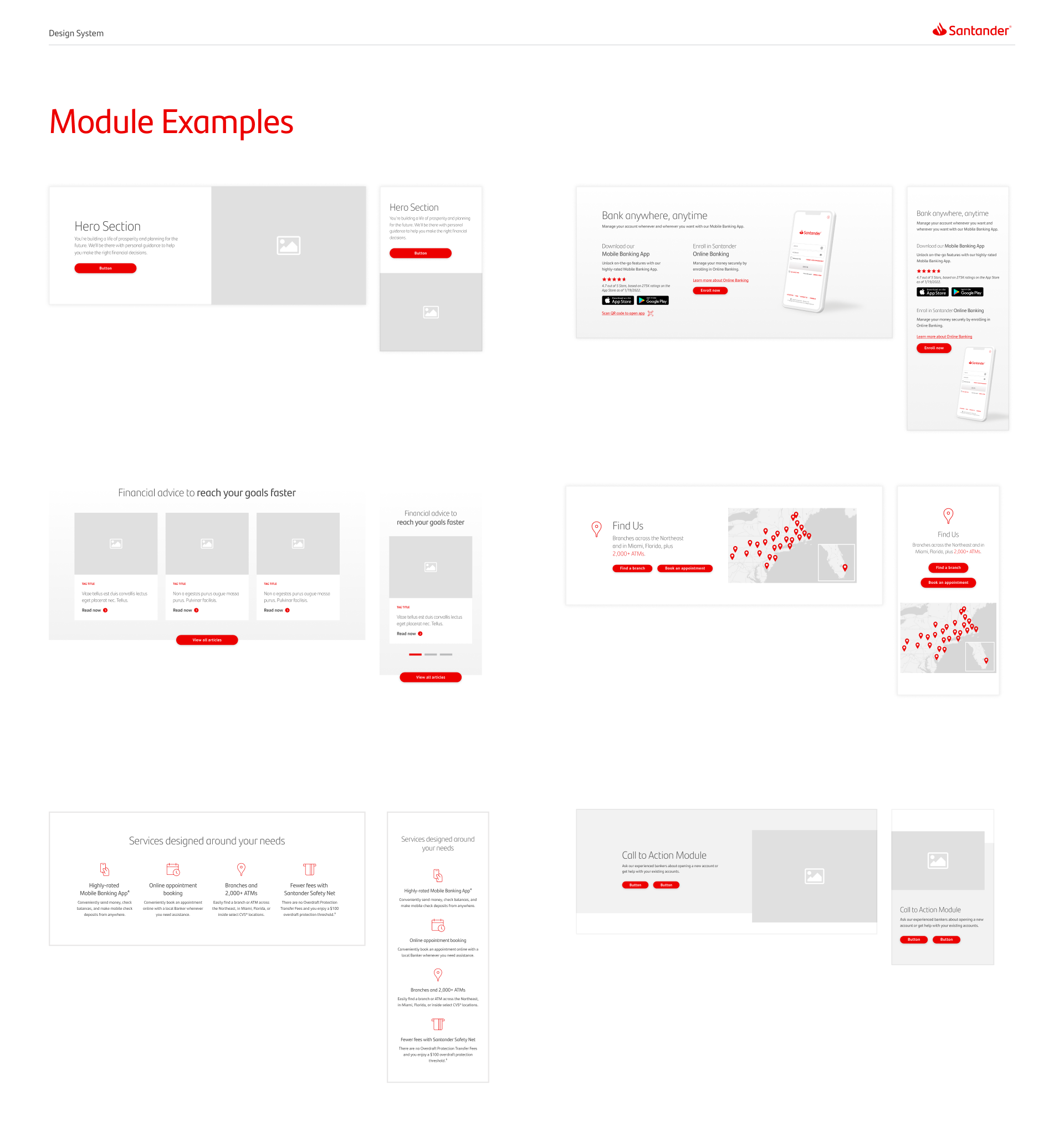
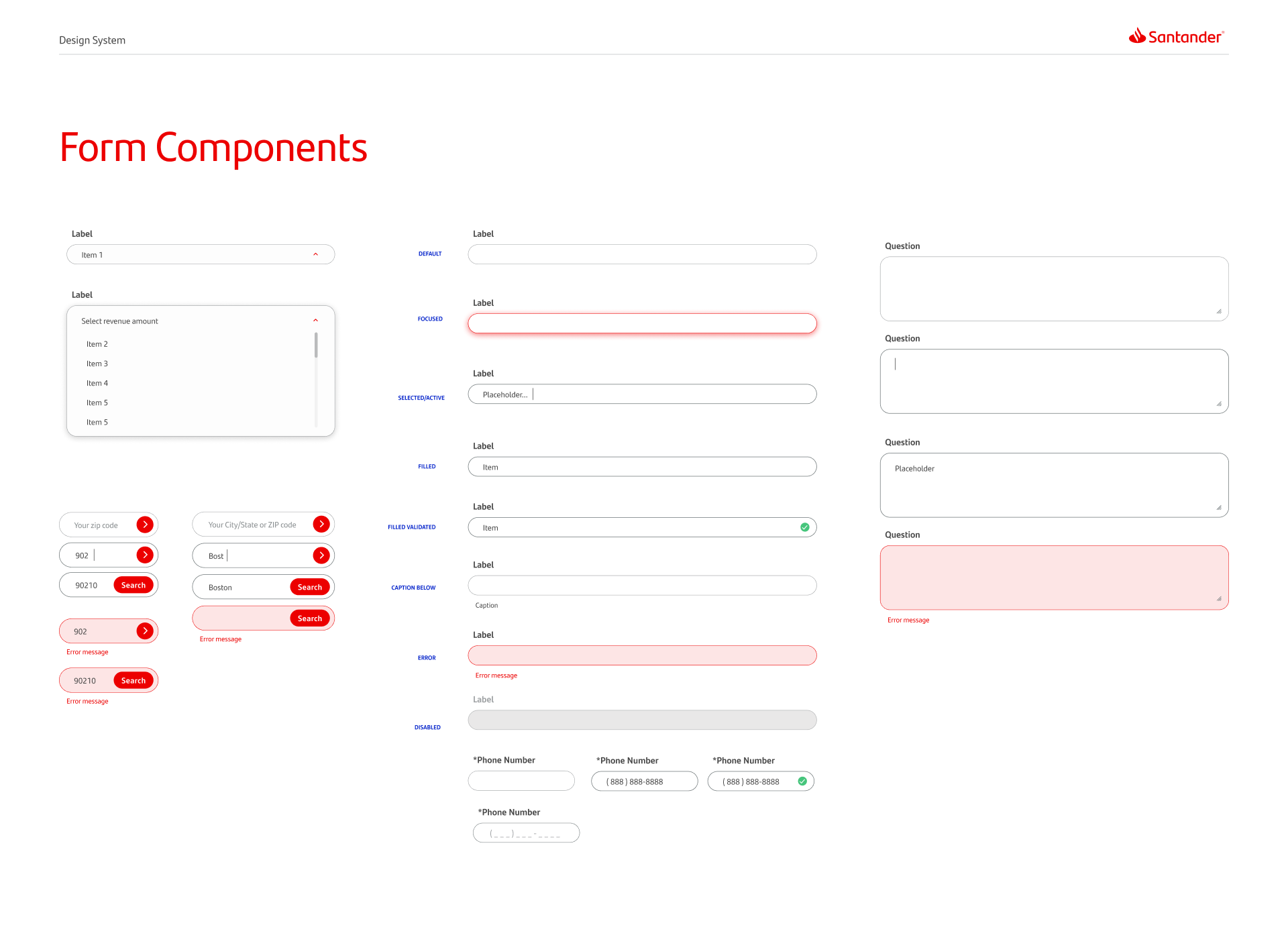
Design System
Throughout the UX and design process of the website, we have developed a robust and fluid design system within Figma to keep our work consistent, and maintain ease of scale with styling and components. This system works hand in hand with an evolving brand identity.