Lumos
Design an education-focused site experience, letting users understand the fiber difference, feel the support of our team, and be empowered to choose the right plan.
Challenge
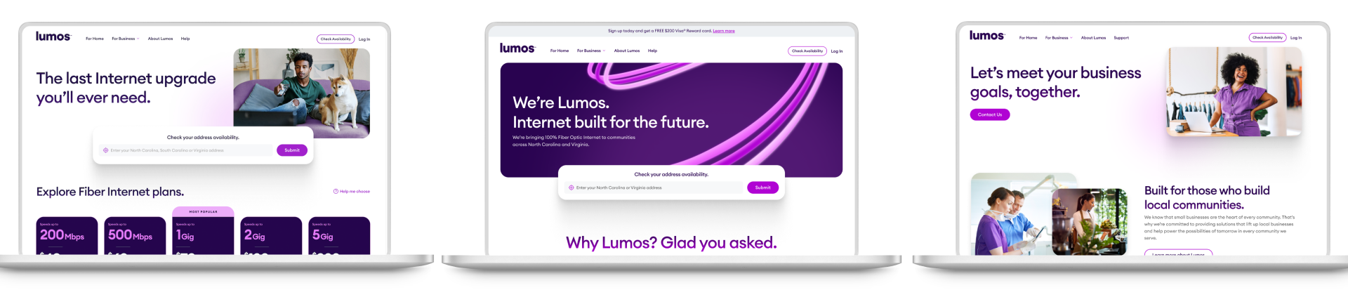
Lumos is a midsize fiber internet provider in Virginia and North Carolina. They have a bold growth agenda and needed a modern, cohesive digital experience to support it. Most of their potential customers have never had a fiber option in their community, so the site and storytelling had to focus on education and transparency.
Solution
A vibrant, energetic design with lots of movement and open space to make scrolling and reading easy. A host of demonstration videos and animations clearly and simply lay out the benefits of fiber over older technologies. And, most importantly, a warm conversational tone to put everything in a real-world context…not everyone knows what a gigabit is, but everyone knows what Netflix is.
PROJECT
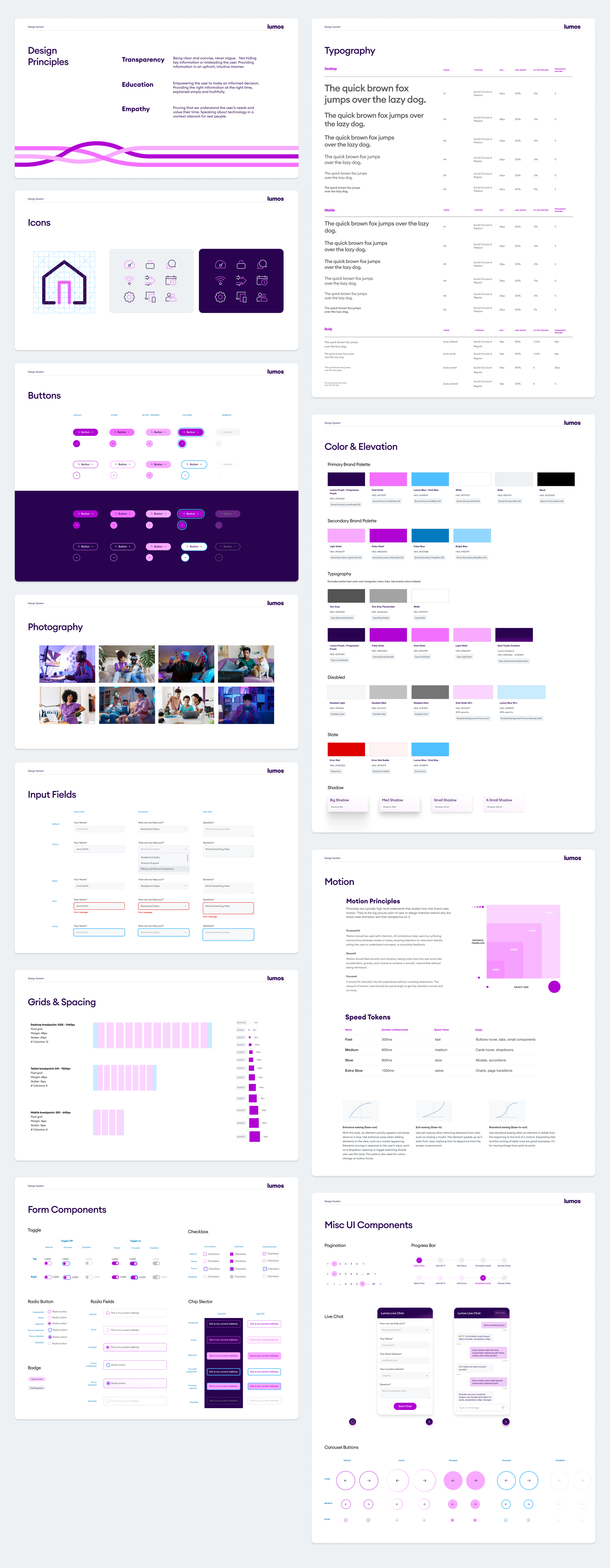
Website design, design system
ROLE
Design & Art Direction
COLLABORATION
Part of the Lumos team at GALE Partners

KEY DISCOVERY ACTIVITIES

Competitive Audit
Some key gaps in fiber websites included complex plan comparisons, a lack of fiber education, and speed tests that didn’t explain the results or next steps.

Content Audit
Our site audit revealed a lack of clarity around product offerings, an unengaging homepage and distractions within their current purchase flow.

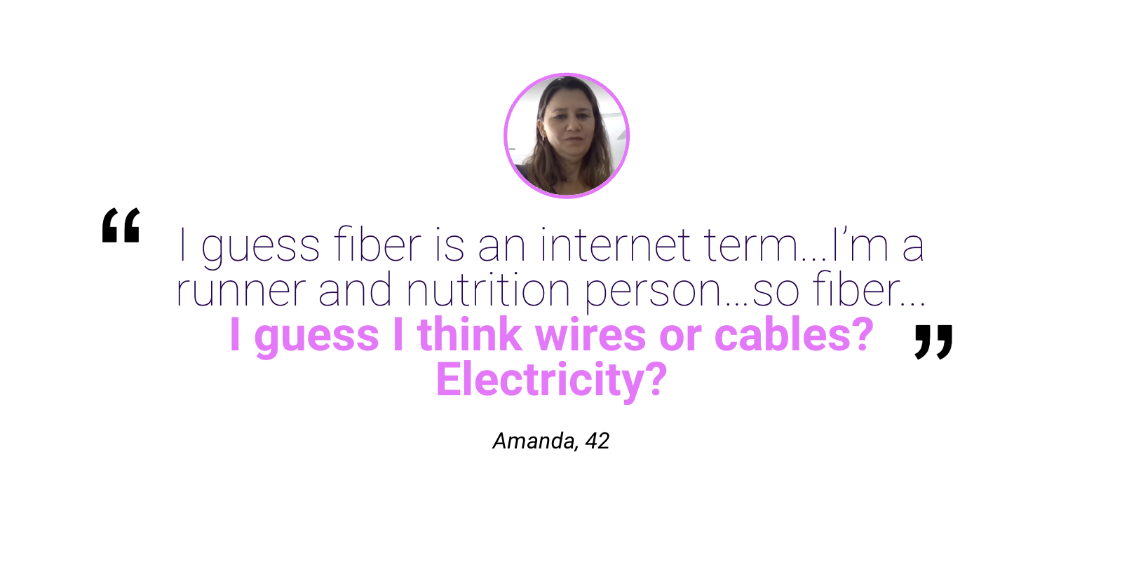
Qualitative Interviews
One-on-one user interviews showed us a lack of understanding of Internet terminology. Meeting users where they are at was a big part of our strategy — aka “Netflix,”not “mbps.”
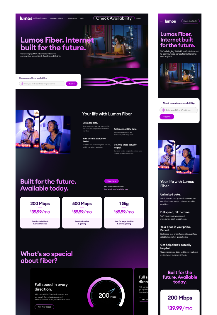
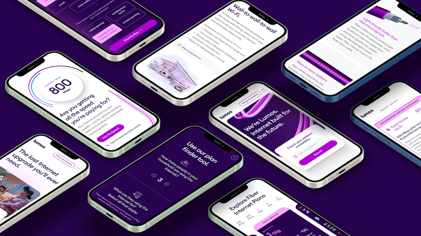
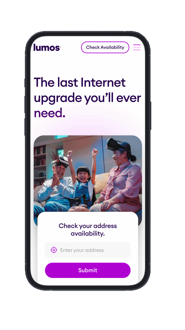
This project focused on creating a best-in-class experience to educate customers in North Carolina and Virginia on the value that fiber internet brings. Our discovery was centered around understanding user mindsets and laying a robust foundation for creating an experience inclusive of tools, resource pages, and a custom educational checkout flow that is optimized for conversion.


No one understands 500 megabits. But everyone understands Netflix.
One of our user interview findings was that people want to know how their lifestyle and usage needs to align with the plans. So, we designed a plan finder tool that helps users find the right internet plan based on their unique usage needs.
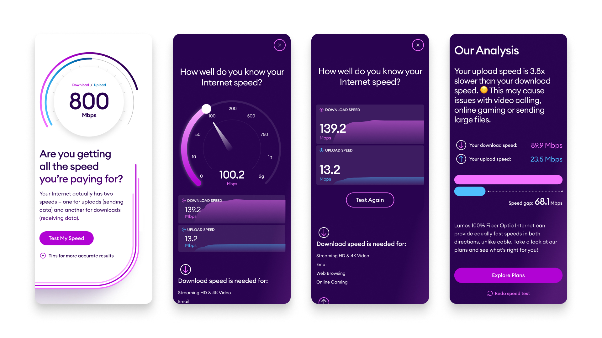


The speed test story
Instead of a typical speed test, we built one that moved seamlessly from your results into a compelling story about how fiber can increase your bandwidth and stability.


DESIGN CONCEPT EXPLORATION
During the concepting phase, we created two directions that delivered on the guiding principles, and felt uniquely Lumos.
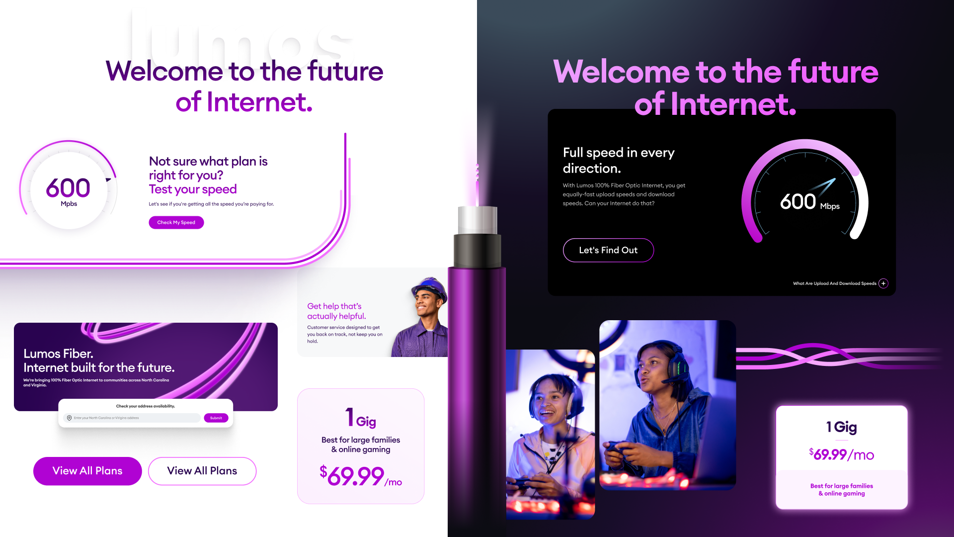

DIRECTION 1:Future Forward
Open and Futuristic
Almost like the inside of a spaceship, this design is sleek, simple and sophisticated. Information is concise and next steps are clear.
Our name means “light”, so we’ll use it to create shadows and contours to highlight important content and add playful elements as people scroll.
Designed for Speed
We want to live up to our promise of faster internet. So we use pops of purple and imagery carefully to reduce page ‘weight.’ We want to run smoothy on mobile and slower connections (which most of our prospects will have.)
DIRECTION 2:Powered Up
A Familiar Glow
LED lights are ubiquitous on technology.
They’re a signal things are plugged in and powered up. This design direction borrows the feeling of these lights and uses it to make the site itself feel like a powered-up piece of technology.
Built for the Future
About 50% of people use dark mode on their phones. It actually uses less energy — how can you get more future-friendly than that?
We’ll use moments of vivid purple and high contrast alongside delightful interactions to help focus attention and guide people through their journey.