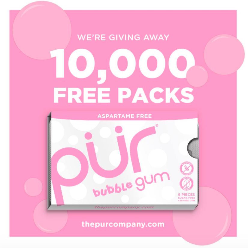
The PUR Company
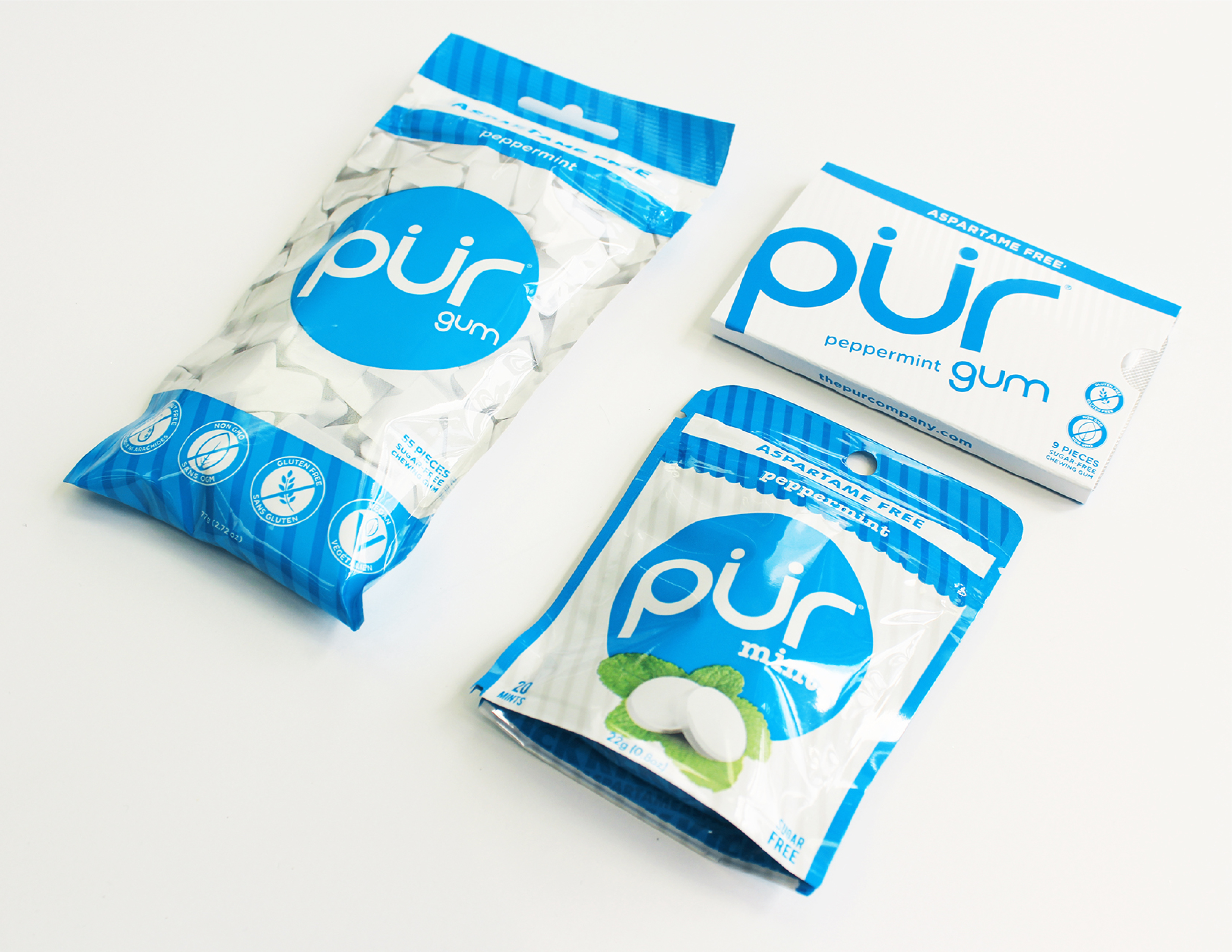
The PUR Company, best known for PUR Gum, is a healthy lifestyle brand whose mission is to make simple substitutions for a better life.
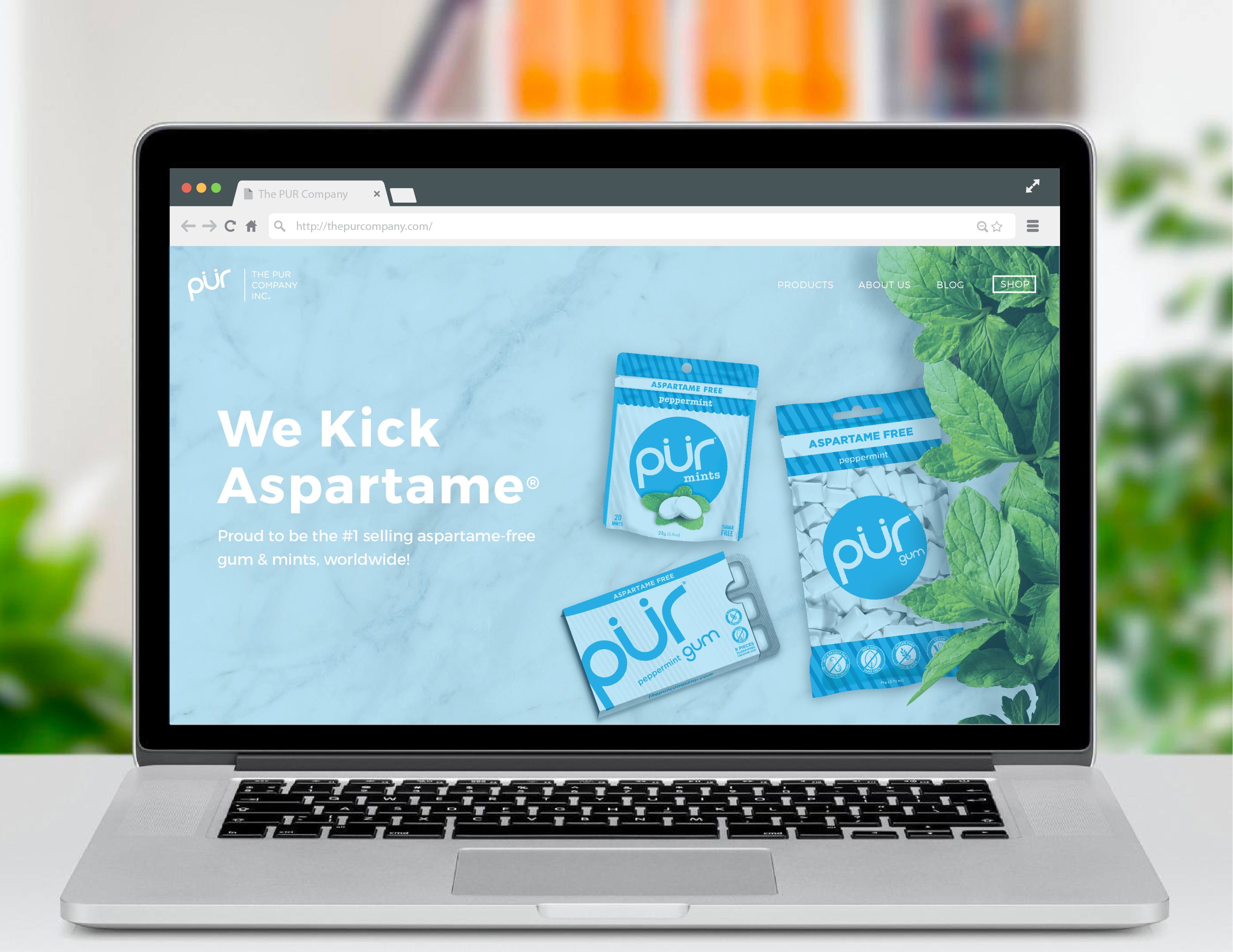
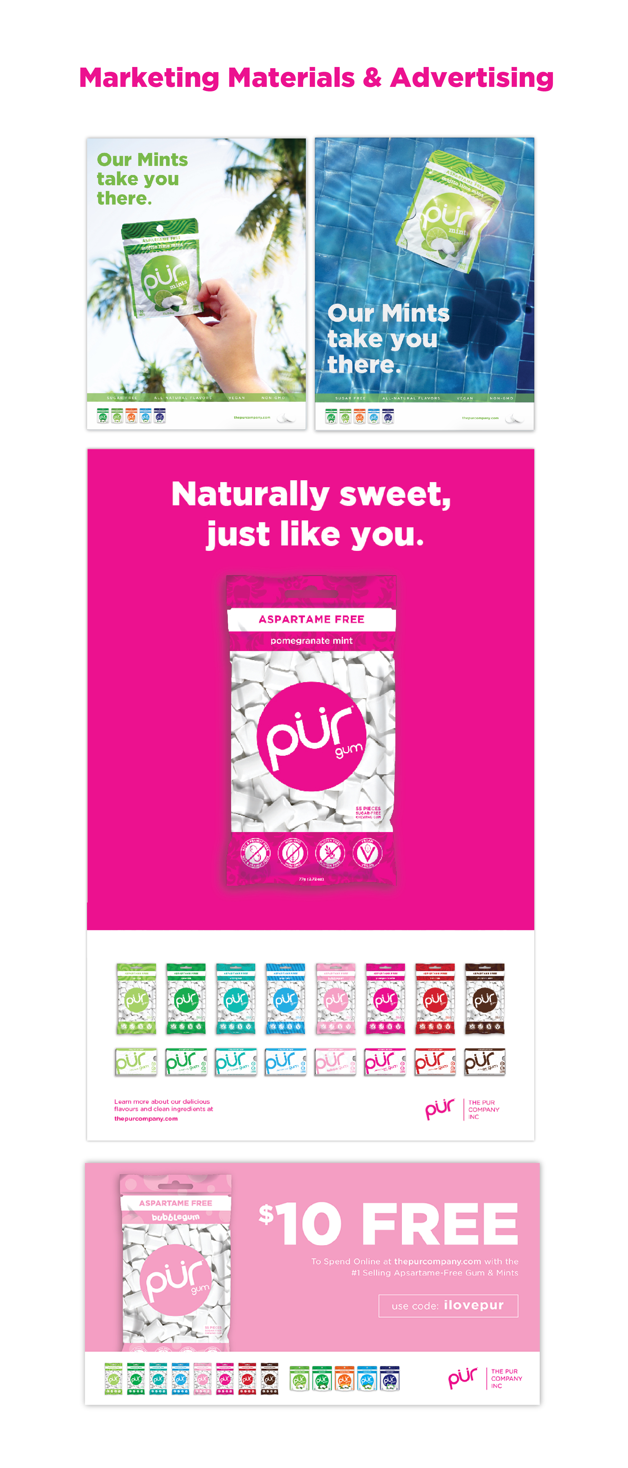
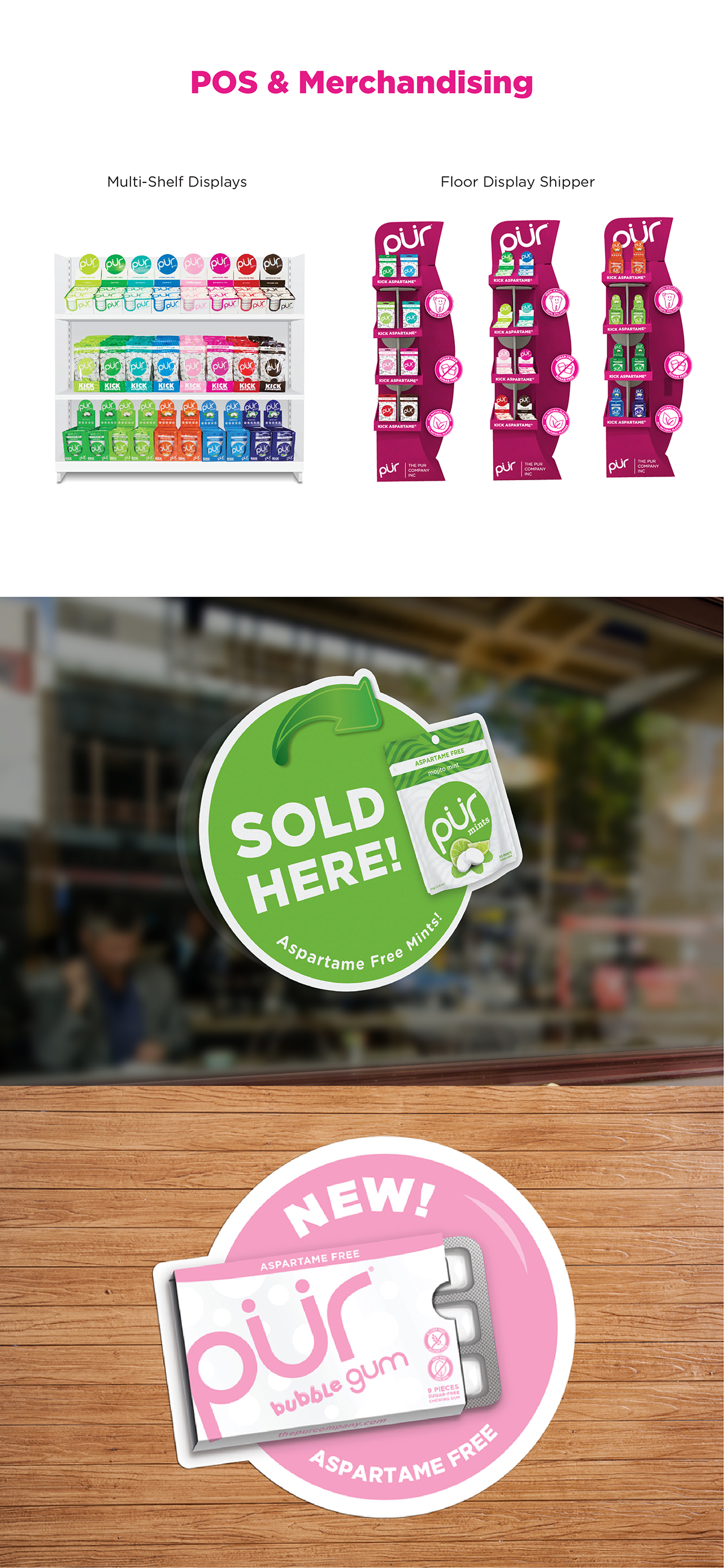
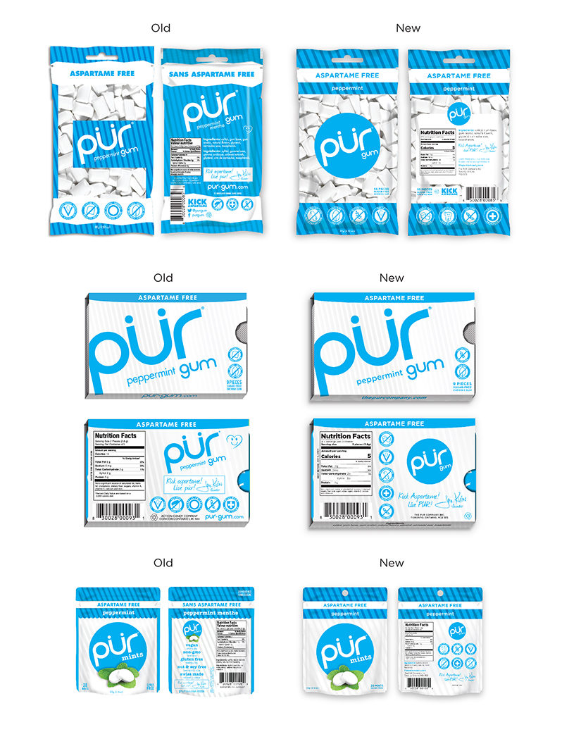
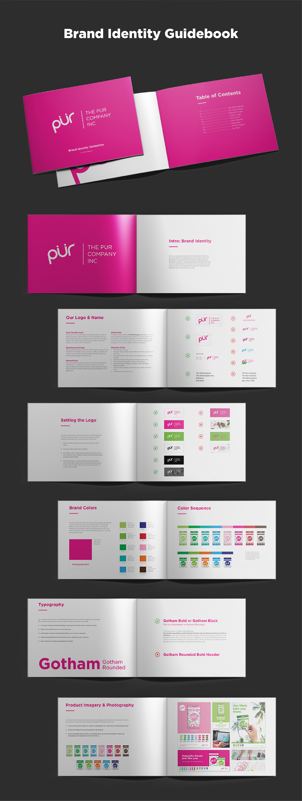
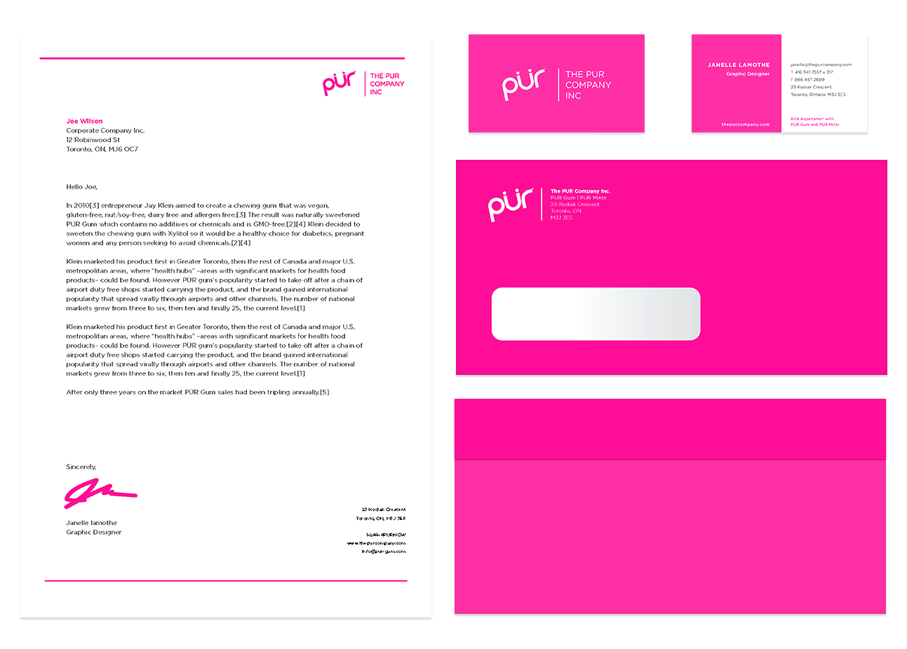
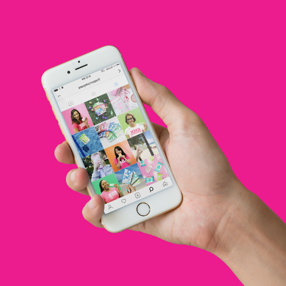
My role at PUR involved successfully honing and curating a cohesive and strategic brand identity. As the lead in-house designer, I worked on every aspect of the company’s design, marketing, and product development initiatives. This includes the complete rebranding for the corporate identity, package design, digital design and marketing, trade-show booths and POS design, product photography, website and e-commerce UX/UI, social media content creation, and more.
I was also involved in the R&D of all new products and concept ideation. This included consumer research, competitive analysis, rapid prototyping and development of package design iterations. This included their first foray into the wider snacking category with the launch of PUR Popcorn.
I work collaboratively with the internal creative/marketing team, and as the lead designer, I provide support and guidance to our junior designers and interns. At PUR I learned how to communicate the value of design to stakeholders and how it benefits the business and improves the market value of the products and brand.
CLIENT: The PUR Company
WEBSITE: thepurcompany.com
DATE: October 26, 2018
SERVICES: In-House design, web design, marketing, and product development
COLLAB: Dalia Haimen


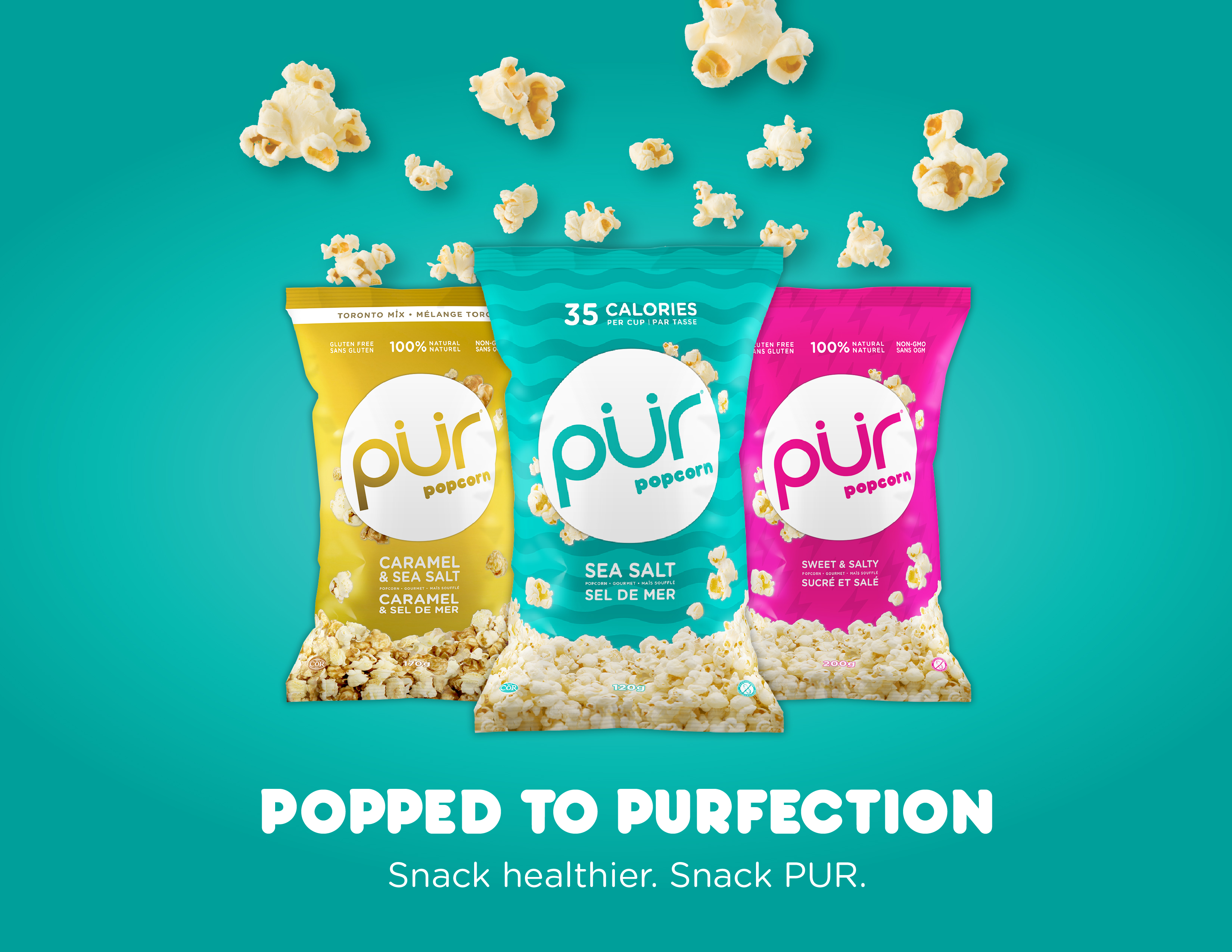
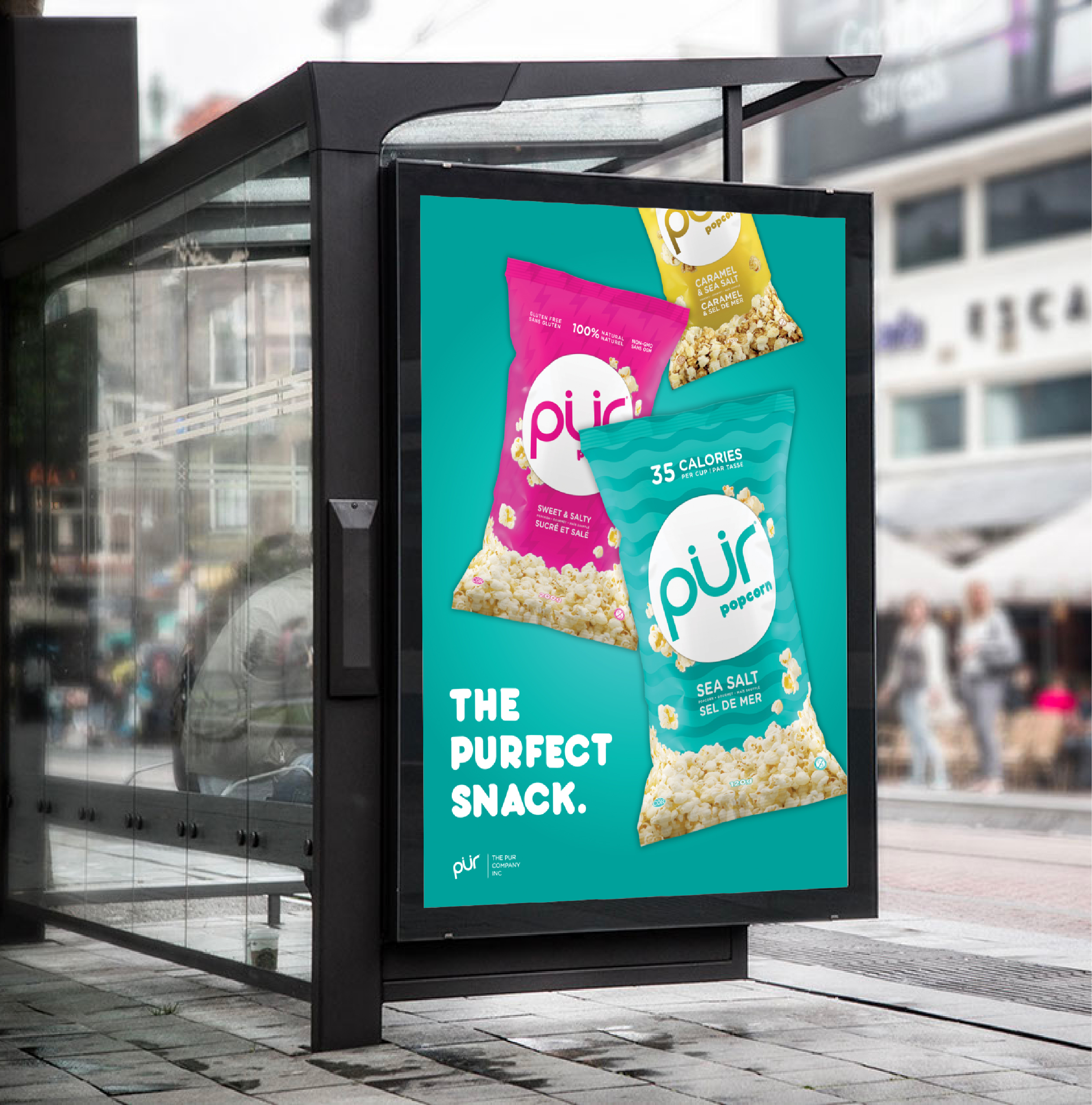
PUR Popcorn Product Launch
PUR Popcorn Product Launch: The first foray into the wider snacking category.
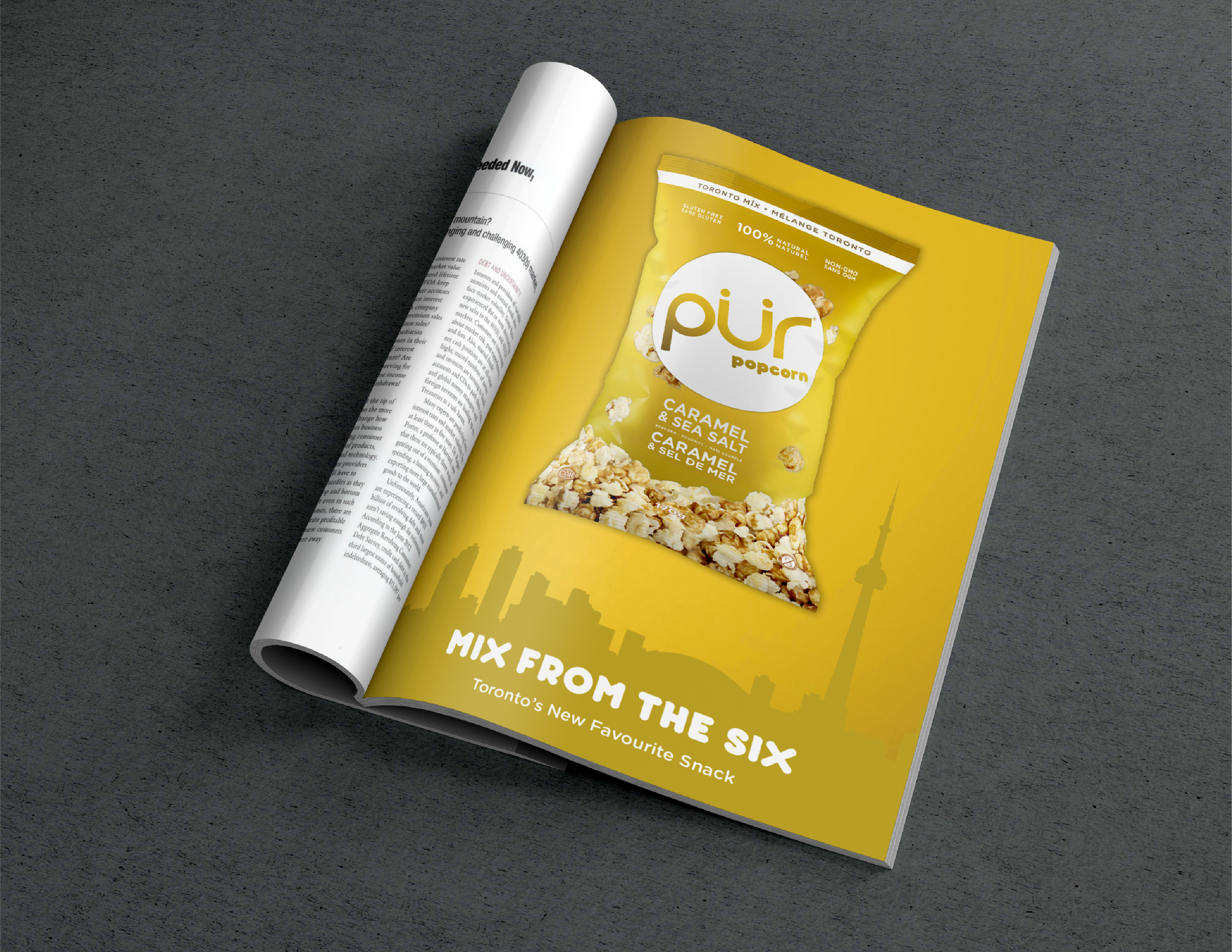
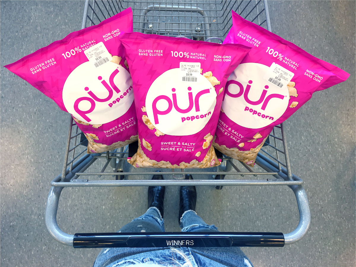
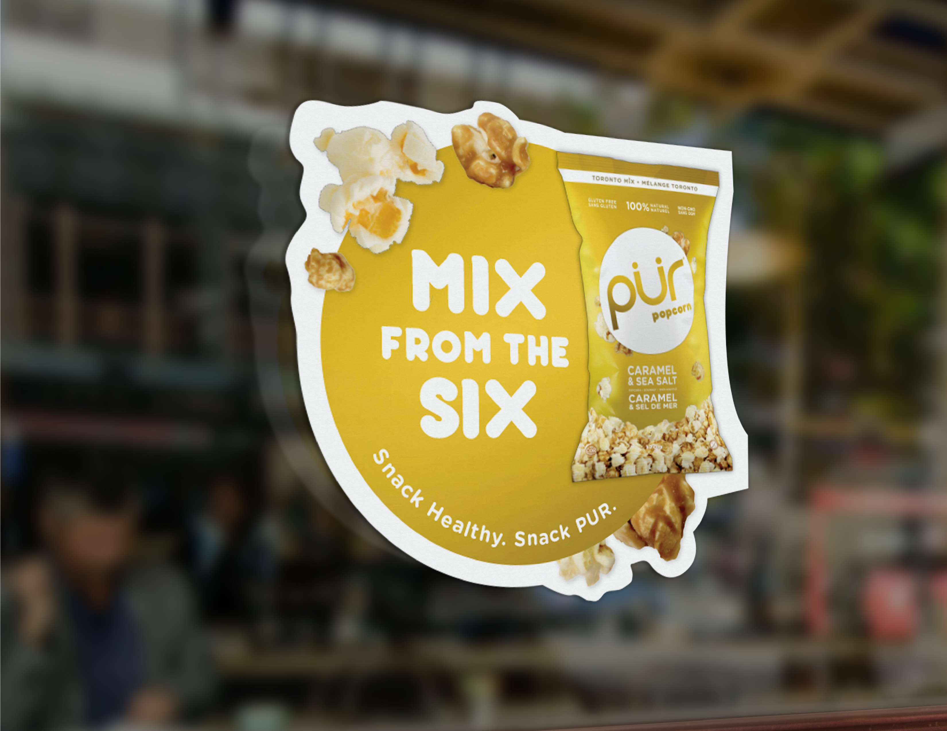
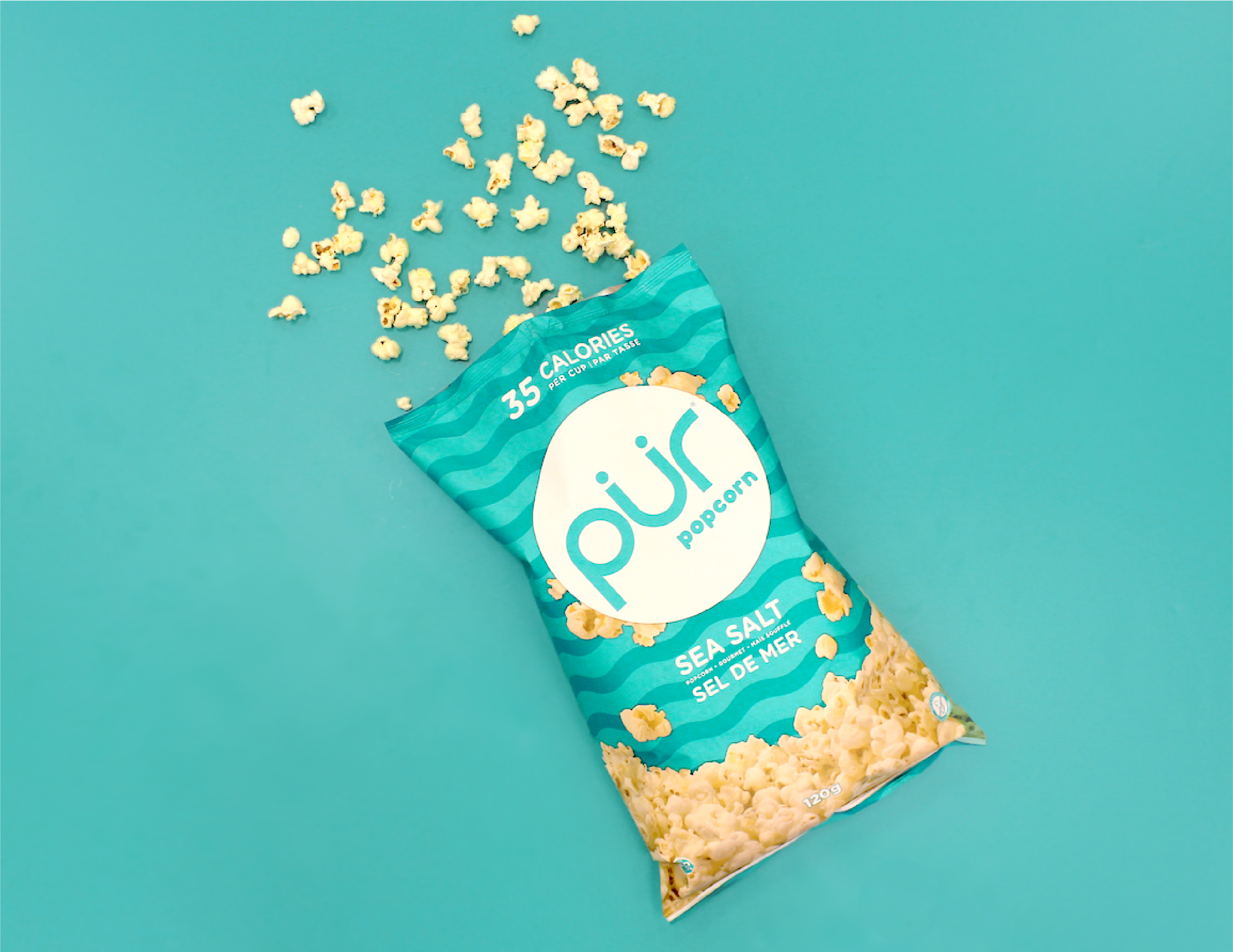
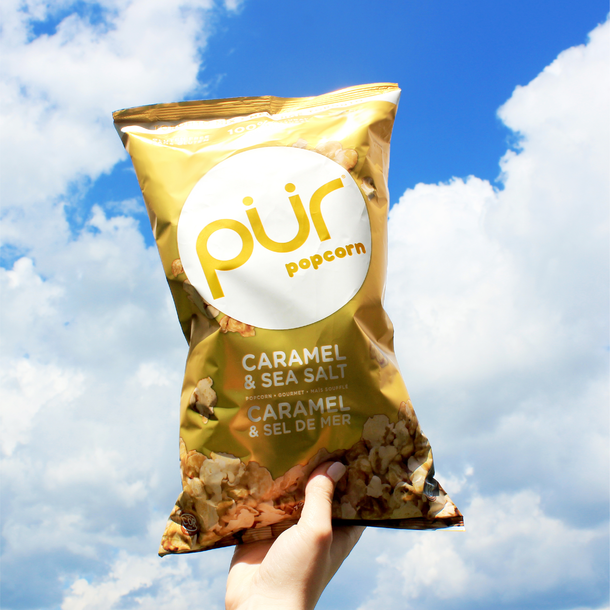
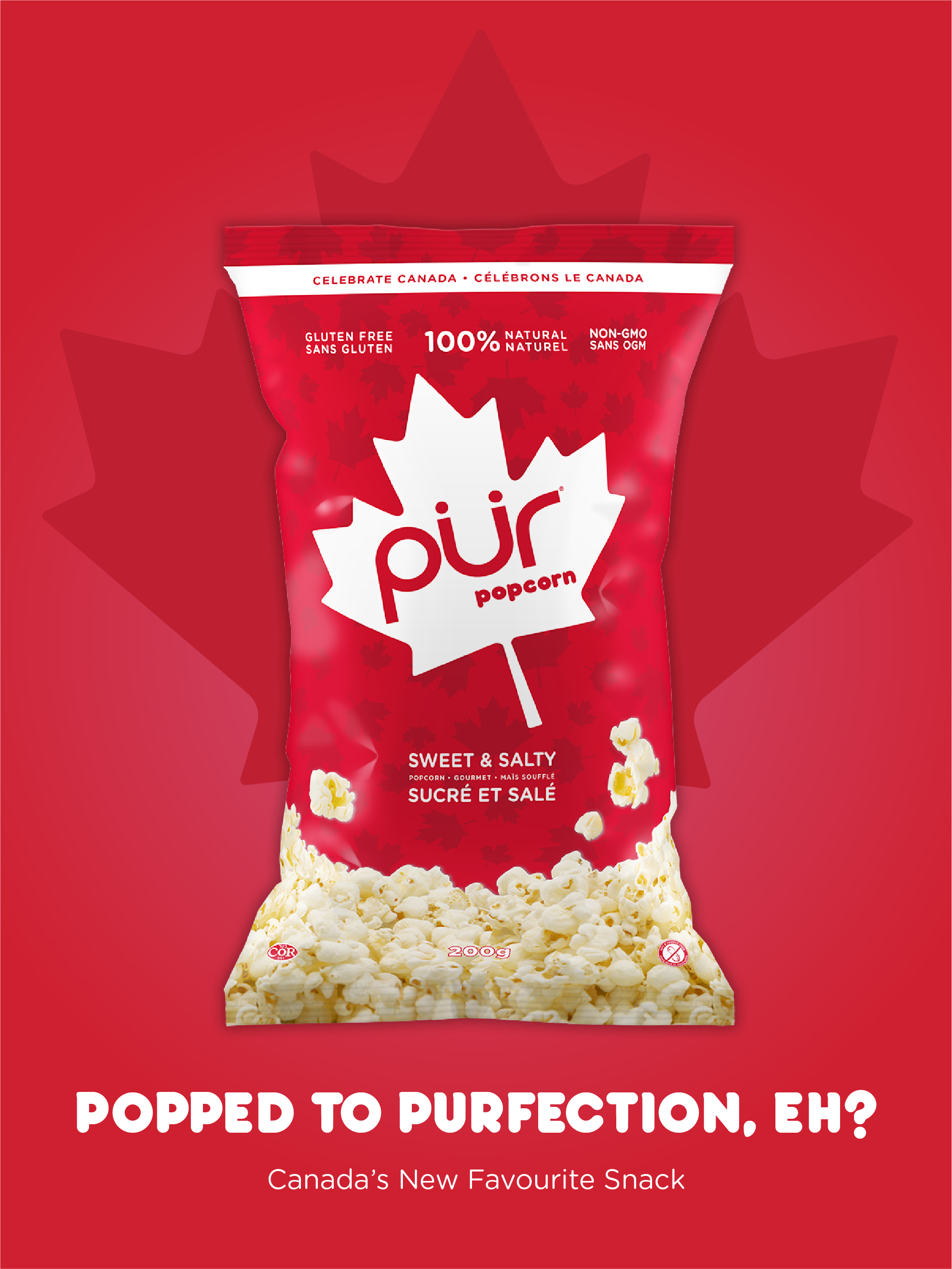
The goal behind PUR Popcorn’s packaging was to create a bold statement within the market, while seamlessly integrating a completely new item into PUR’s existing product offerings. To ensure PUR Popcorn “pops” off the shelves, the bag utilizes a bright and approachable package design that remains true to the brand’s values and aesthetic of delightful simplicity. PUR Popcorn’s punchy white logo and pop-art inspired color and pattern schemes harmonize seamlessly as an extension of PUR’s existing product lines. We opted for a bold metallic yellow gold finish for the Caramel and Sea Salt flavor, affectionately nicknamed “Toronto Mix” or “The Mix from the Six”, inspired by PUR’s hometown. The gold reflects the more indulgent quality of the flavor and represents Toronto’s distinct and vibrant personality, while the other two flavors have a sleek, matte finish. The packaging of each PUR Popcorn flavor reflects its unique quality that is also complimentary as a cohesive product line.
We were presented a tight 4-month timeline to work through research and development, concept design, pre-press, and production, along with the creation of all marketing materials (which included an interactive and responsive microsite).
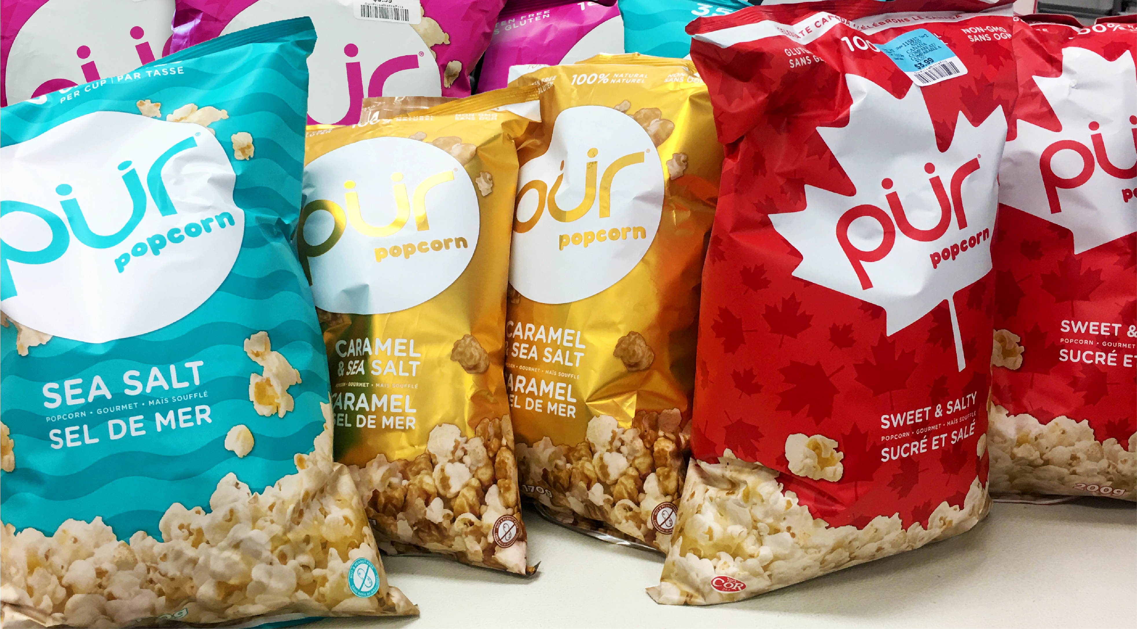
PUR’s product lines continue to disrupt the natural product category’s selection of muted, earth-colored packaging. As a result, PUR Popcorn’s launch has led to stronger brand recognition among both new and existing customers. In reaction, all three flavors were sold out within weeks of the product’s soft launch and has been a successful step into making PUR the go-to brand for healthier alternatives for everyday favorites.
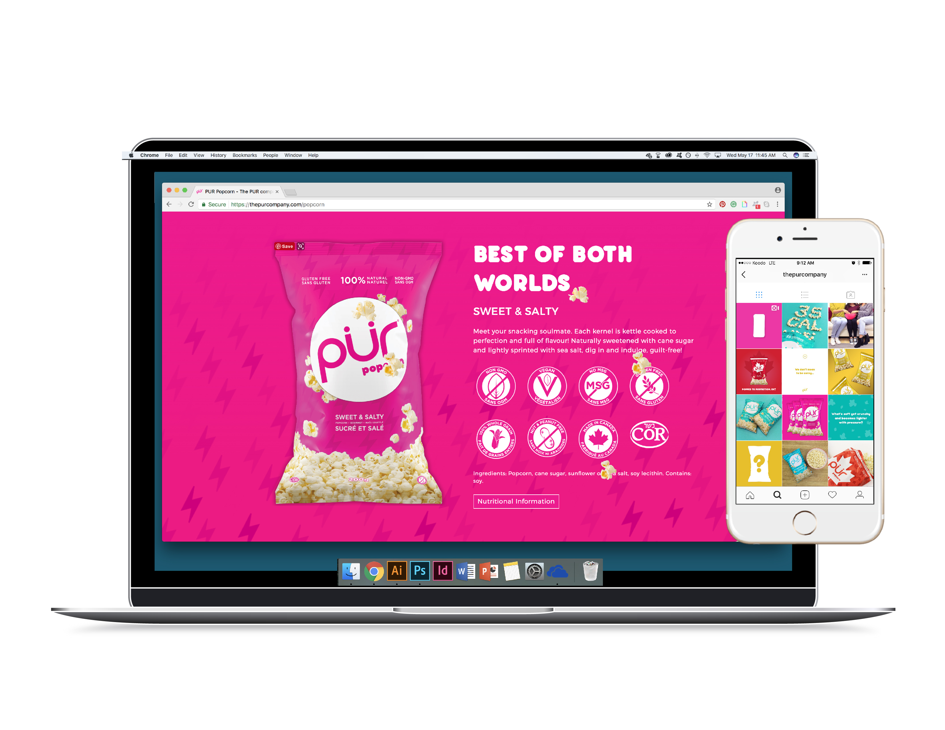
MICROSITE: thepurcompany.com/popcorn
SERVICES: Package Design, Microsite Design, Marketing